
The Complete Pacific Comics Re-Reading Blog Series presents:
Schanes and Schanes Portfolios
Back in the early 80s (when I was like 12) I got a copy of the Bud Plant mail-order catalogue, and among all the comics and posters that intrigued me, there was a category I didn’t quite understand: Portfolios. I dimly seem to remember I ordered one with… uhm… Was it Wendy Pini? I was mightily disappointed when it turned out to be just a folder of loose-leaf reproductions and not comics at all.
This is a blog series about Pacific Comics, but Pacific Comics had its origins in a publishing venture by the Schanes brothers called (appropriately anough) “Schanes and Schanes”. They published almost exclusively portfolios throughout the 70s and early 80s.
One of the companies my brother Steve and I owed in the ‘70’s and ‘80’s was a publishing company called Schanes & Schanes (S&S). S&S was really focused on prints, posters, and portfolios. Over the years, we released over 40 different portfolios, each was hand signed and numbered, in limited editions.
So I thought it might be interesting to have a look at what they looked like before we dive into Pacific Comics proper, and I have selected, at random, a couple of these portfolios on Ebay. I tried getting the underground one:
Robert Crumb signed and numbered the prints, including some extra cuss words on selected plates, plus he included a hand written note to me, which was basically a long series of cuss words, yelling at me at how heavy the boxes were, and he might have hurt his back lifting them.
When we got to the very end of the job, we discovered that Crumb has neatly written something on the back of his final signed plate in pencil. In his distinctive lettering, it said “I hated doing this. – R. Crumb”.
But I couldn’t find anybody on Ebay selling a complete version of the portfolios: They all had missing plates.
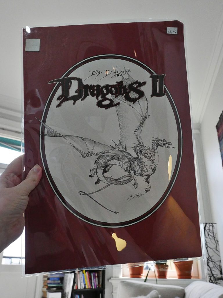
Dragons II by Lela Dowling (from 1983)…
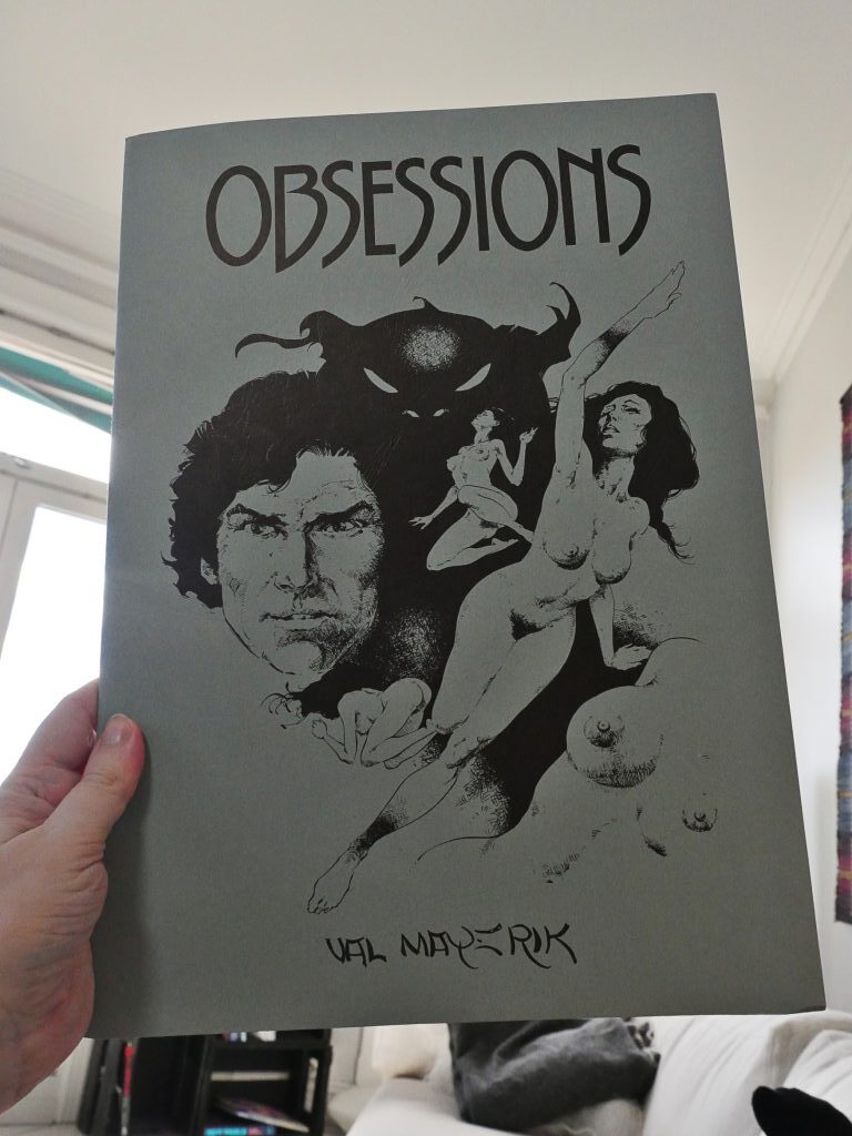
… and Obsessions by Val Mayerik from 1980. They’re both oversized: 29x42cm. The Dowling one comes in a plastic sleeve. Let’s have a look at it first.
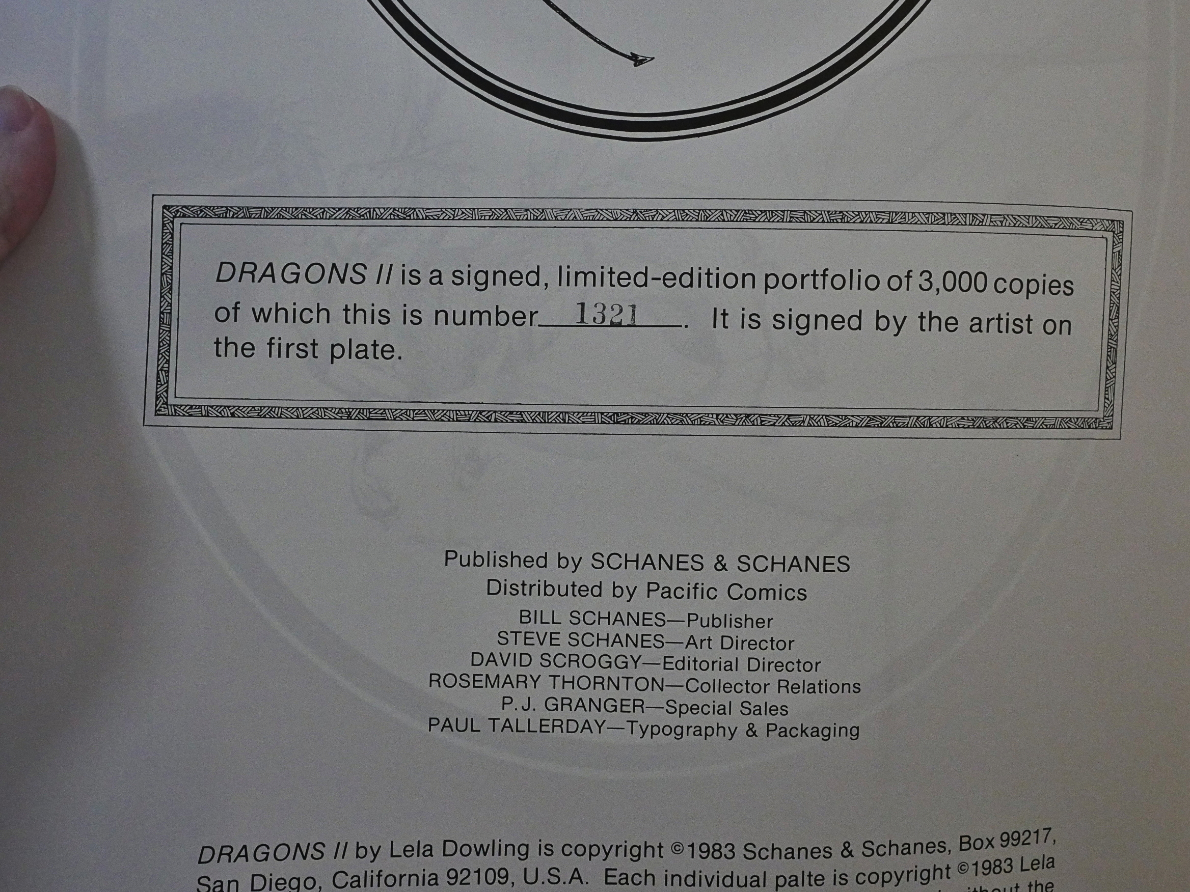
Oh, these were released in pretty large editions: 3K. These must have been quite lucrative items to publish…
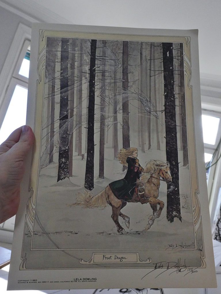
There are six plates, printed in colour, and the first plate is signed and numbered. They look very handsome: The printing is very nice indeed.
So what I wondered back when I was 12 and got my first (and until now, only) portfolio was: What am I supposed to do with this? OK, I’ve looked at it, and that’s nice, and now what? What I missed was that you can just, like, put them on your wall and stare at them while getting high.
Which explains why all copies of the underground portfolio mentioned up there is missing plates.
I’m guessing that that’s how this category got to be a big thing in the 70s, and why it’s something that all but disappeared from view now.
Also, comics back then were printed on cheap paper in awful printing presses, so portfolios were the only way to see an artist’s work for real. These days the printing process is much better… and if you want something for your walls, you order a “giclee print” (i.e., inkjet print) from the artist’s web site.
So the portfolio concept has gone the way of the dodo.
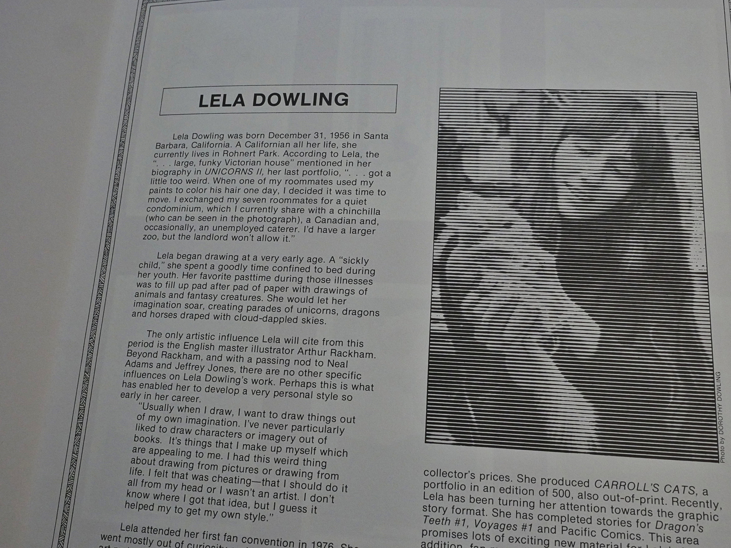
There’s a little bio on the inside back cover written by David Scroggy.
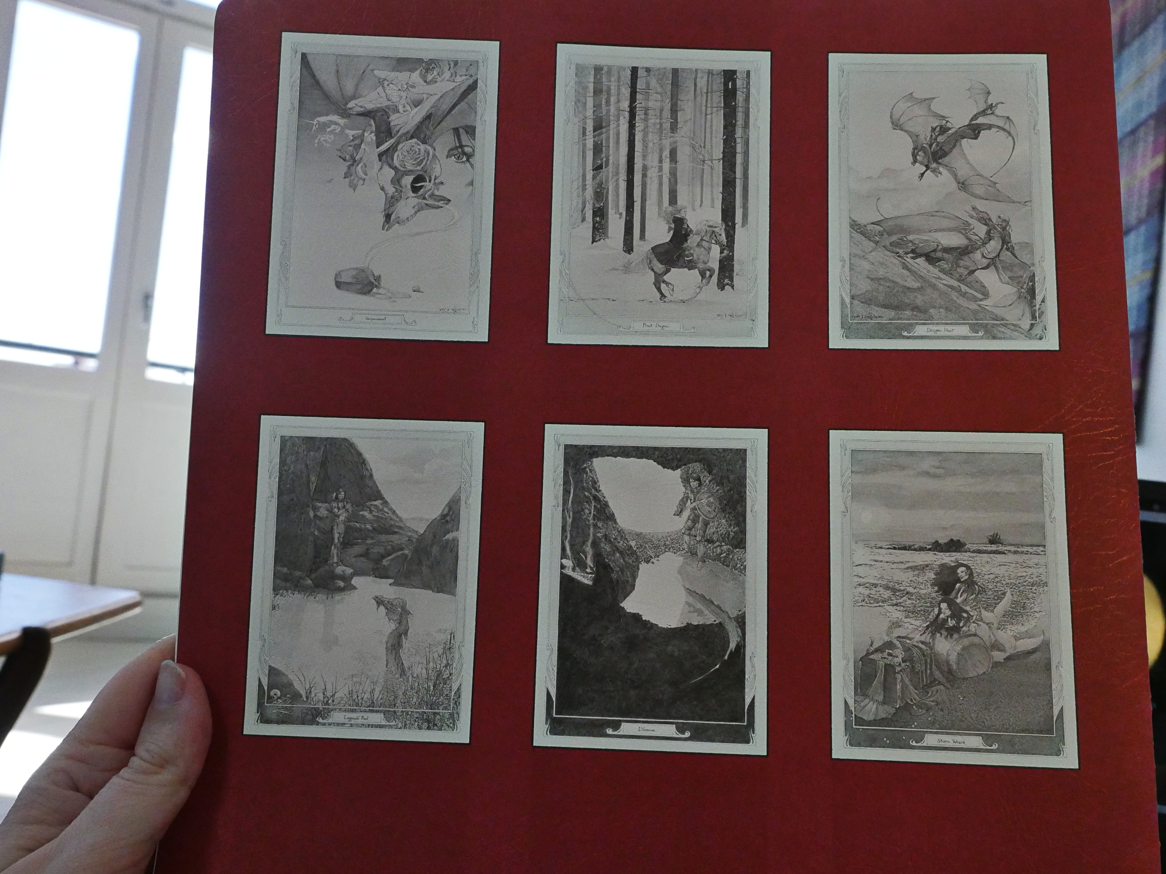
And tiny reproductions of the six plates.
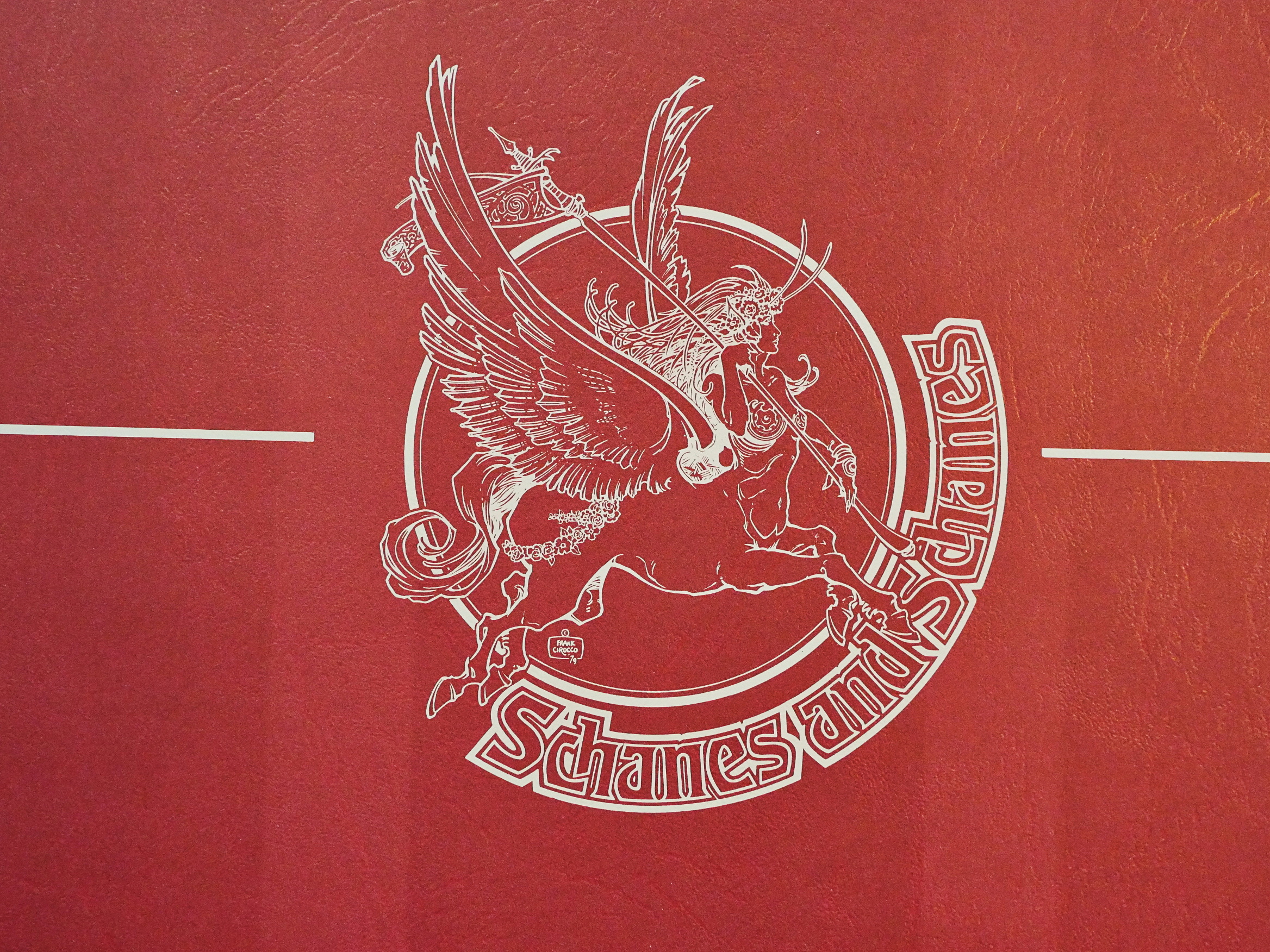
Oh, wow, that’s some logo for Schanes and Schanes.
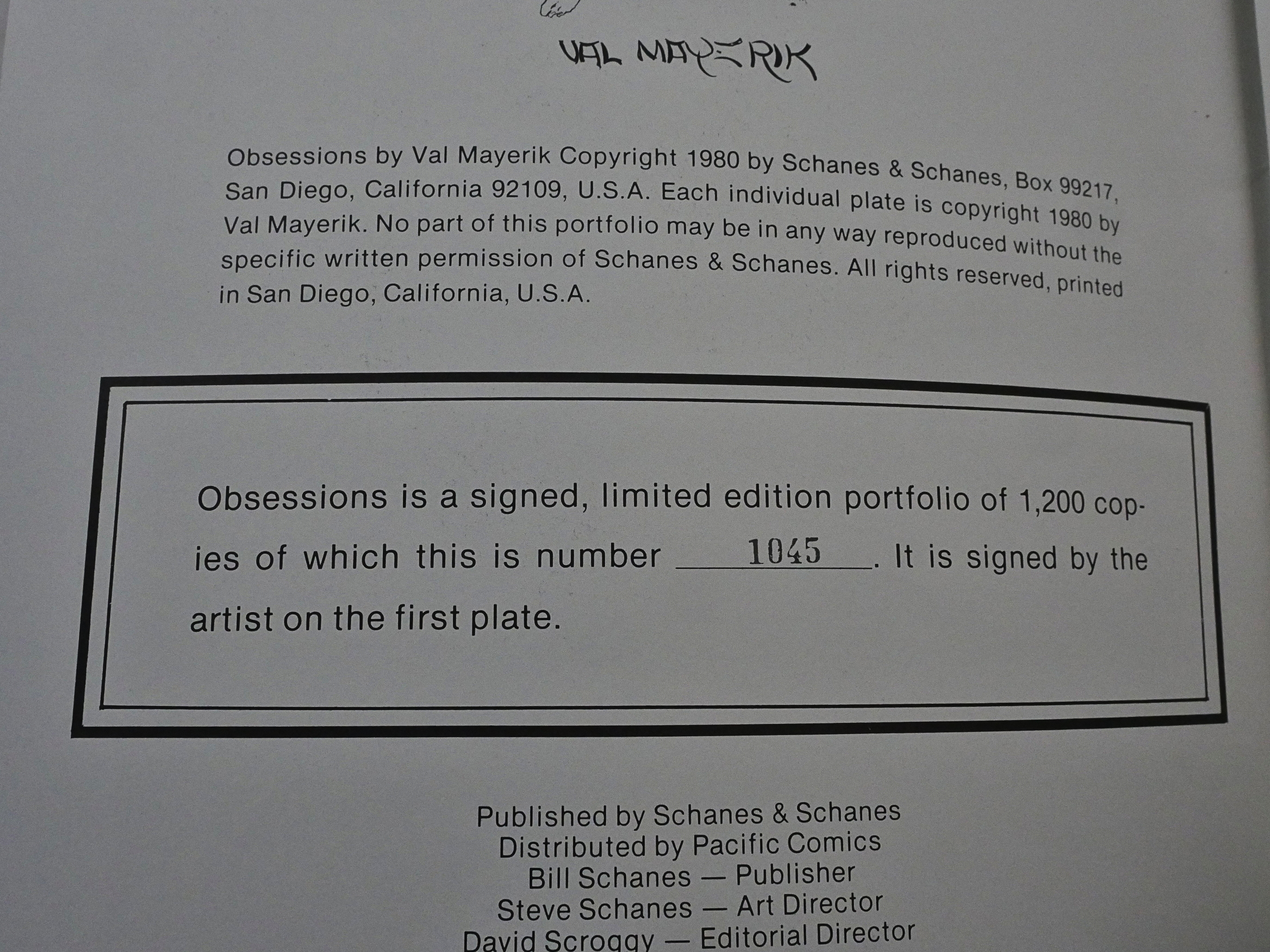
The Mayerik portfolio is in an edition of 1200 copies.
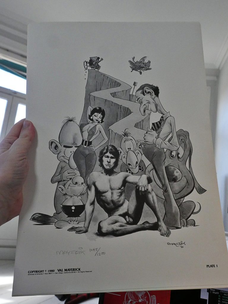
As with the Dowling one, there’s six plates and the first plate is signed and numbered. However, this one is in black and white.
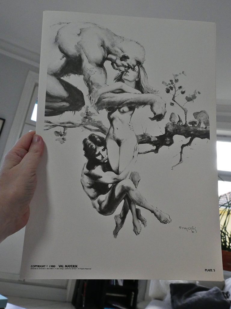
The subject matter is… er… So the sensitive artist is clinging to the woman who prefers that BRUTISH MAN.
It’s kinda eh.
But nicely printed.
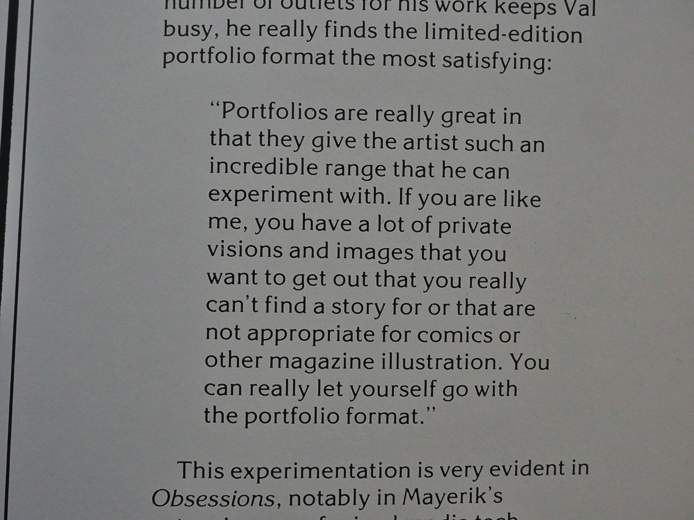
And again, as with the Dowling, there’s an artist’s bio on the inside back cover, and here Mayerik explains the allure of doing portfolios.
Beyond that they presumably pay a lot of money.
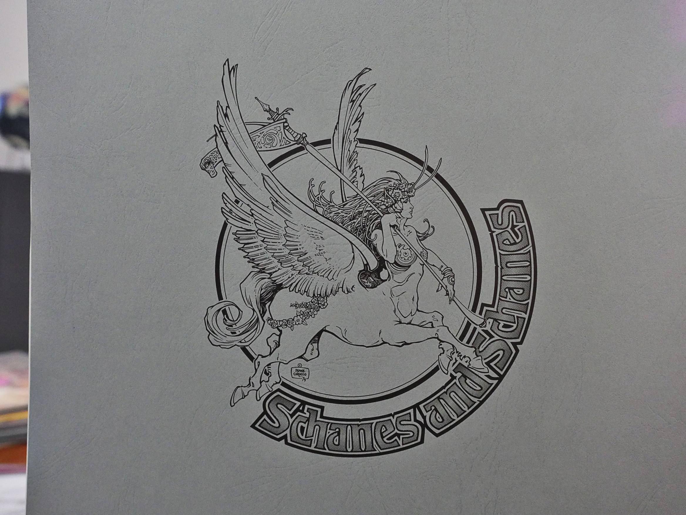
Oh! And that great Schanes and Schanes logo by Frank Cirocco again.
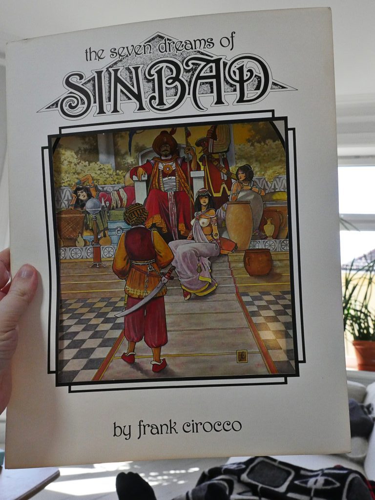
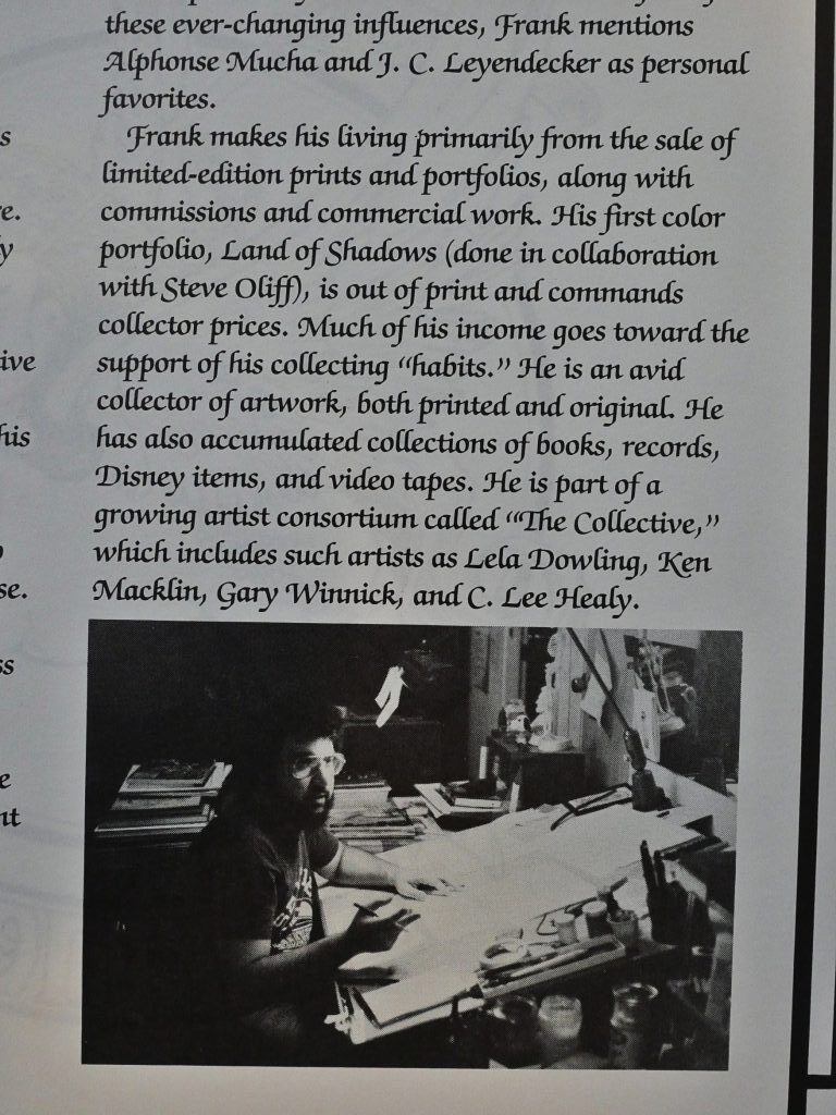
Oops. I had forgotten that I had bought this portfolio by Frank Cirocco, too. “The Seven Dreams of Sinbad”, and, indeed, this one has seven plates.
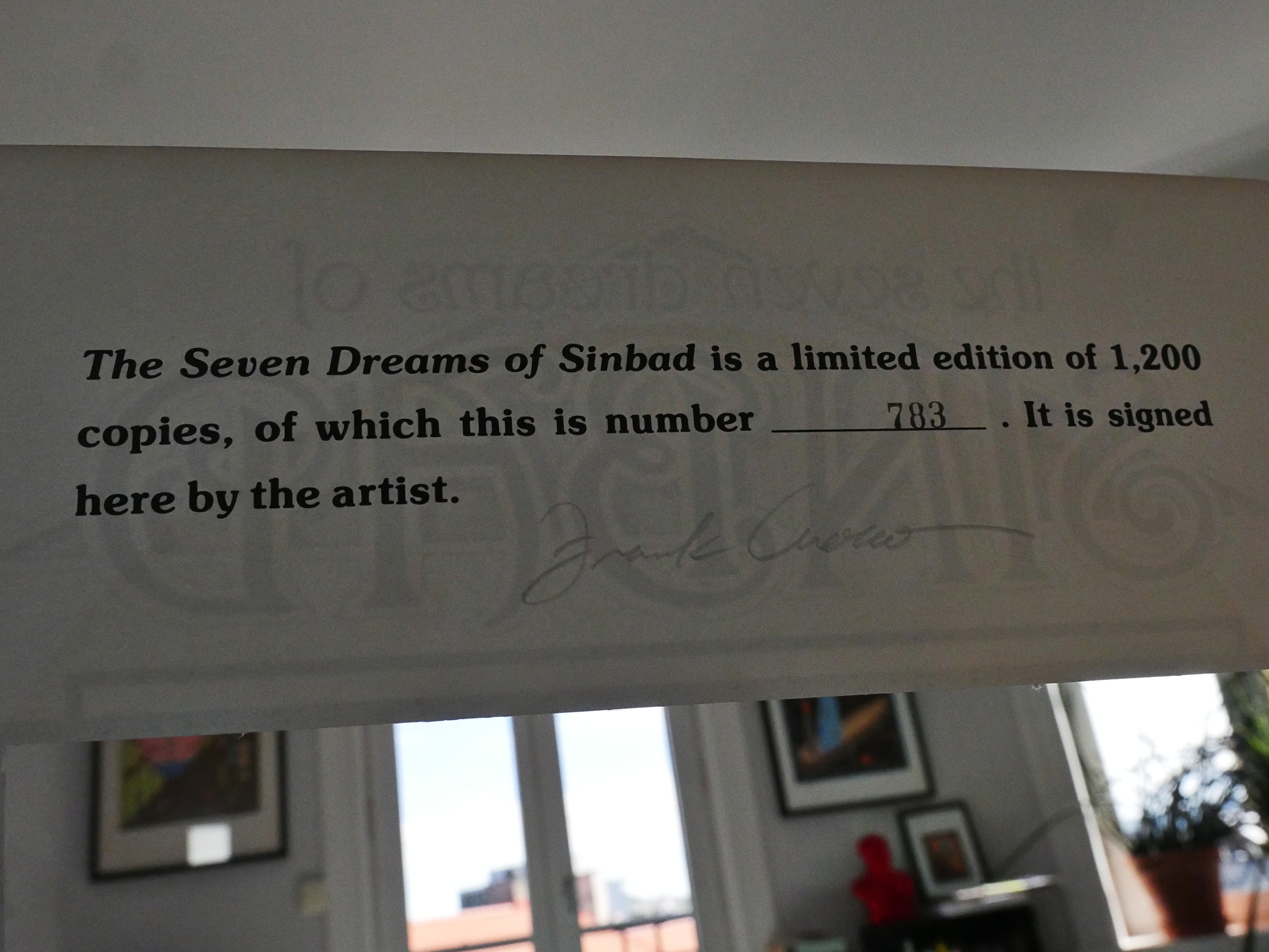
But instead of a plate being signed, the portfolio itself is signed.
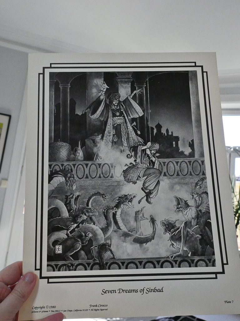
Only the first plate is in colour — the other ones are in black and white. Pretty nice, but since you can see the first plate through the die cut in the portfolio sleeve, I’m guessing some people may be disappointed that it’s not colour throughout.
And as with the other two portfolios, there’s a bio on the inside back cover.
So there you go. Damn hippies.
Hi Lars,
Please apply your programming genius to getting this to read “70’s” where appropriate:
> One of the companies my brother Steve and I owed in the ‘70’s and ‘80’s was a publishing company called Schanes & Schanes (S&S).
Mind, this happens all over the www so maybe you’d be in line for a medal…?
I think I fixed that now in this post…
Really enjoying this blog, I see my Reader article about working at Pacific is quotes sometimes. I have a complete set of everything Pacific published, including all the portfolios, all of which are intact other than the Heavy Metal Cell Portfolio, which I pulled a few cells from to frame and subsequently lost in a storage unit robbery. The crazy size of some of them made them nearly impossible to display in a retail setting, but there were some really lovely editions like the two Frank Brunner “Alice” portfolios, with artwork mostly unseen anywhere else other than a Carnal Comics special. The hardest to find Pacific items are the comic strip-sized Movie Stars reprints, they too were too odd a size for anyone to display —