
The Complete Pacific Comics Re-Reading Blog Series presents:
Vanguard Illustrated
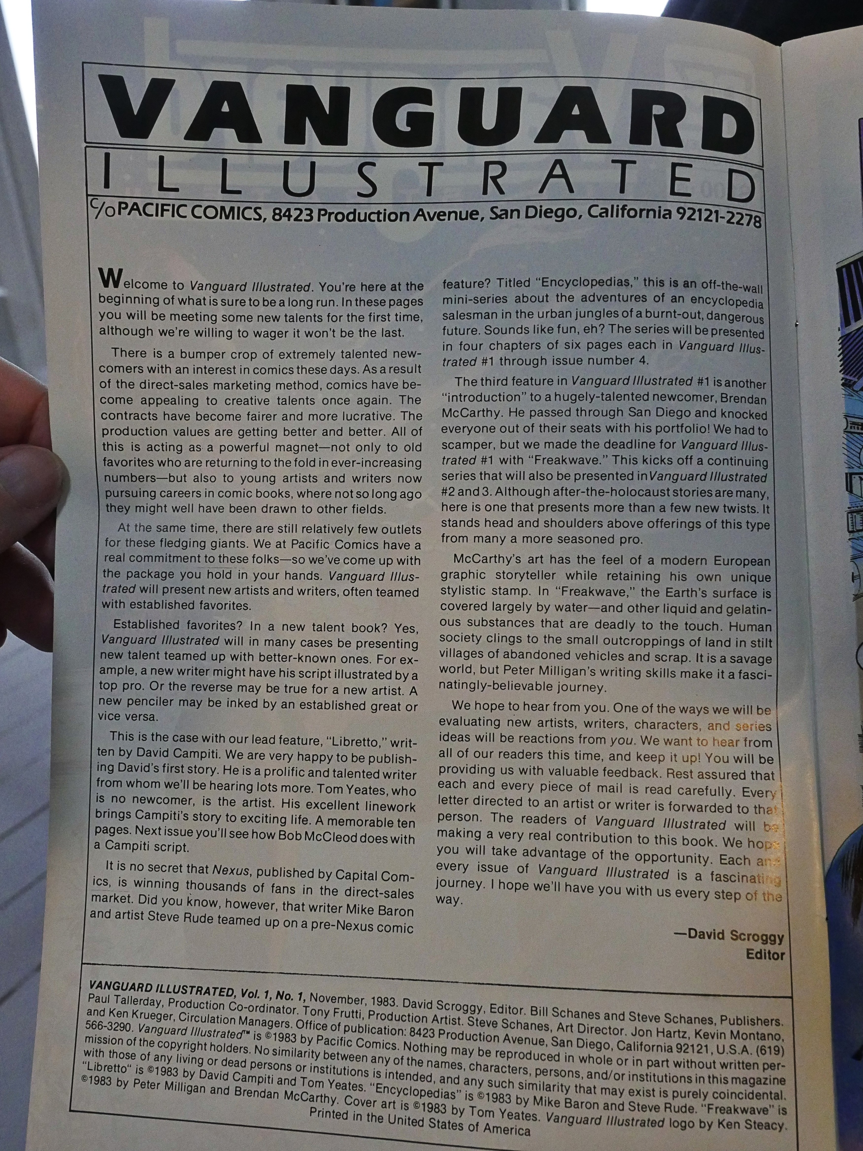
edited by David Scroggy
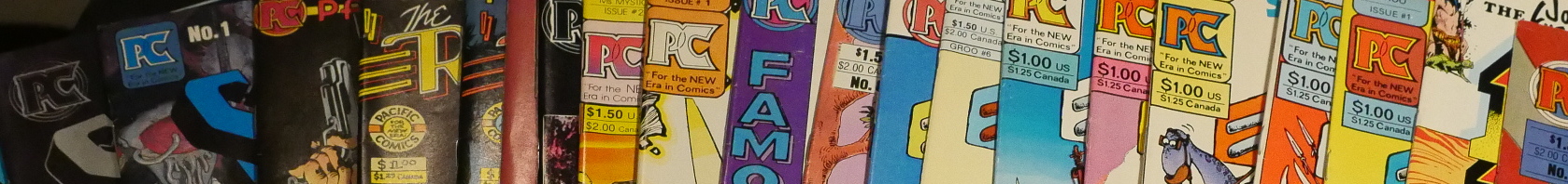
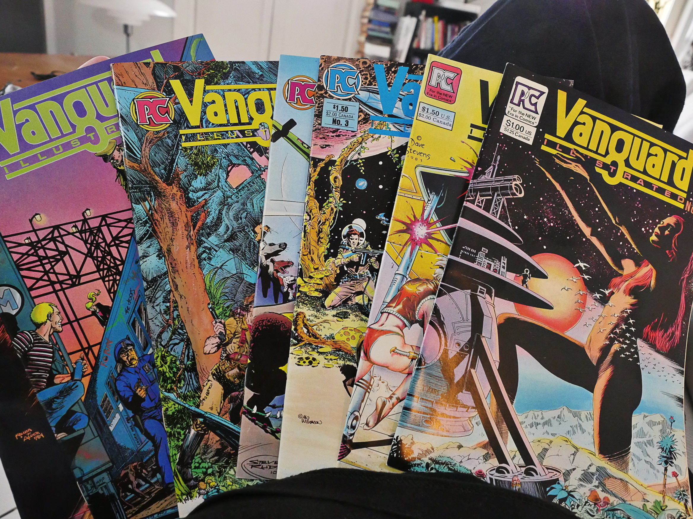
Vanguard Illustrated (1983) #1-7

Pacific, for its size, certainly had a lot of anthologies. I haven’t counted, but I think in volume, the anthologies must account for at least one third of the comics they published.
I can see the attraction for Pacific, who mainly seemed to go after big name artists for their books, and those big name artists were notoriously late (at least there was much complaining in the trade press at the time). But by doing an anthology, you can just stick somebody else in there if somebody’s late…
So here’s another one, and what’s the concept this time?
New talent! Coupled with big names. So new writer with veteran artist or vice versa.
It reminds me of this quote from co-publisher William Schanes which I’ve probably quoted before:
Each month, I’d update the data to include the most recent sales. I also put a “point value” on each sales level for each category of creator, so when we wanted to put together an editorial team, we wanted to make sure that each new book or story within a book would have a “point value” which we felt would represent the best opportunity to achieve sales of previous books they had worked on.
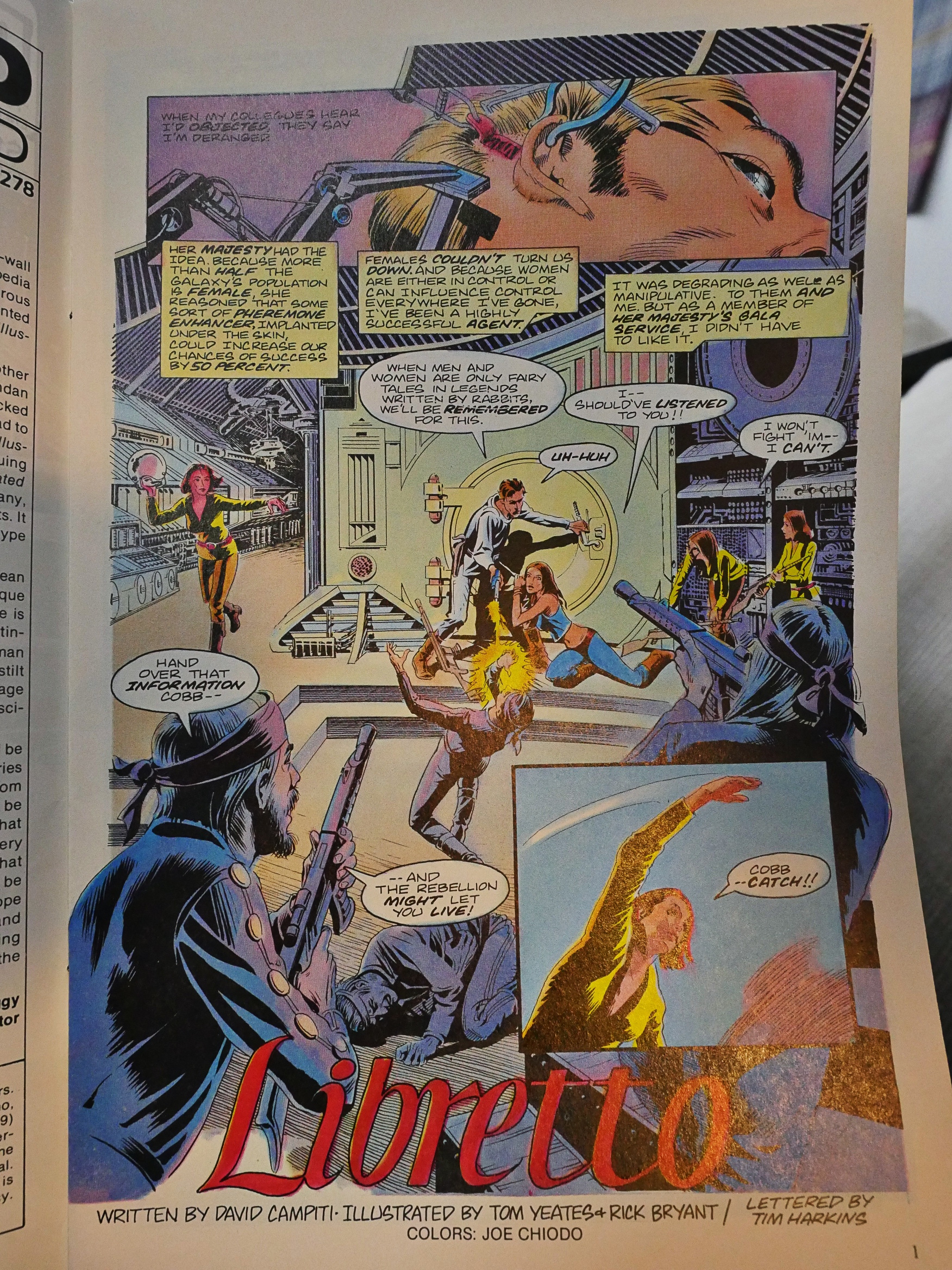
So here you have newcomer David Campiti writing a story illustrated by Tom Yeates and Rick Bryant. It’s a story about a pheromonically enhanced James Bond, but science fiction.
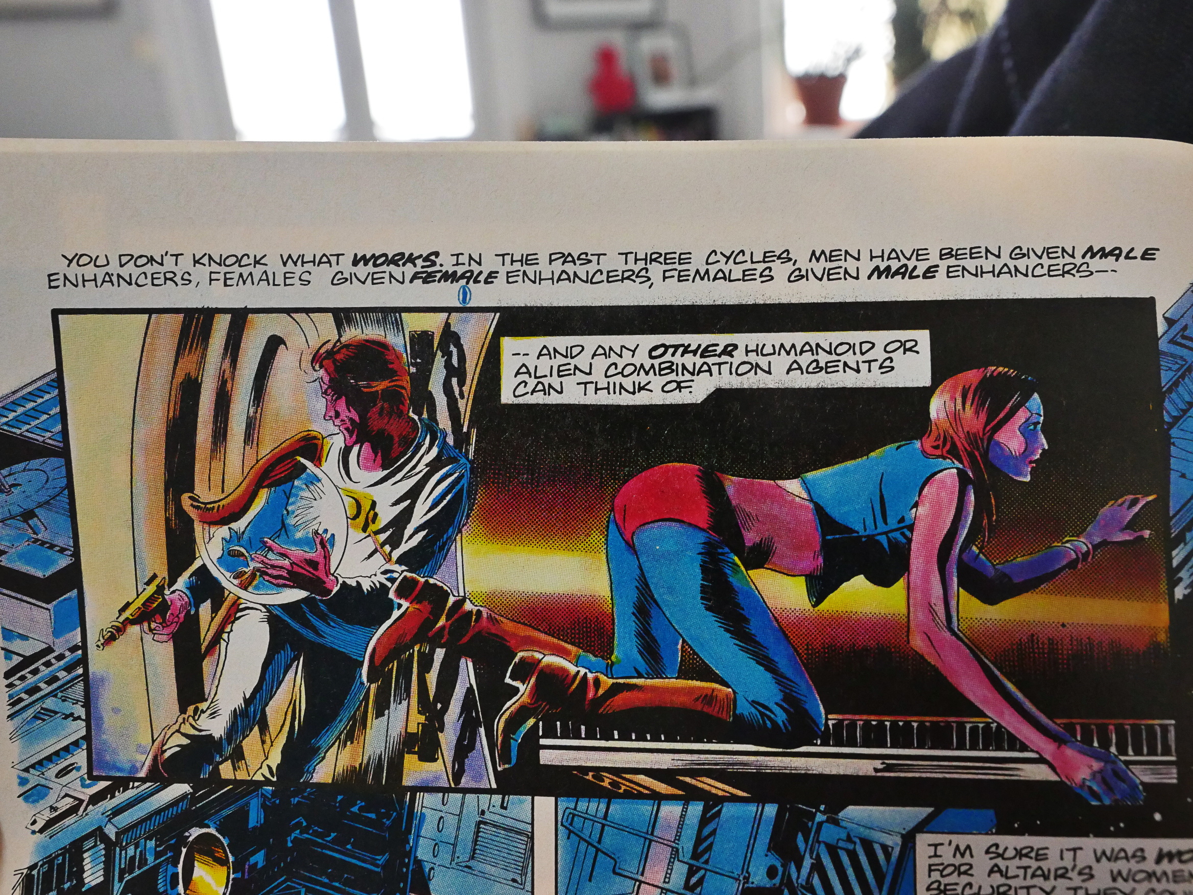
So you have males with male enhancers, females with female enhancers, females with male enhancers, and I guess that’s all the variations that are even conceivable, because then there’s “and any other humanoid or alien combination agents can think of”.
It turns out James Bond is so sexy that he even manages to seduce a sentient planet that turns out to be female.
Yeates’ artwork is nice as always.
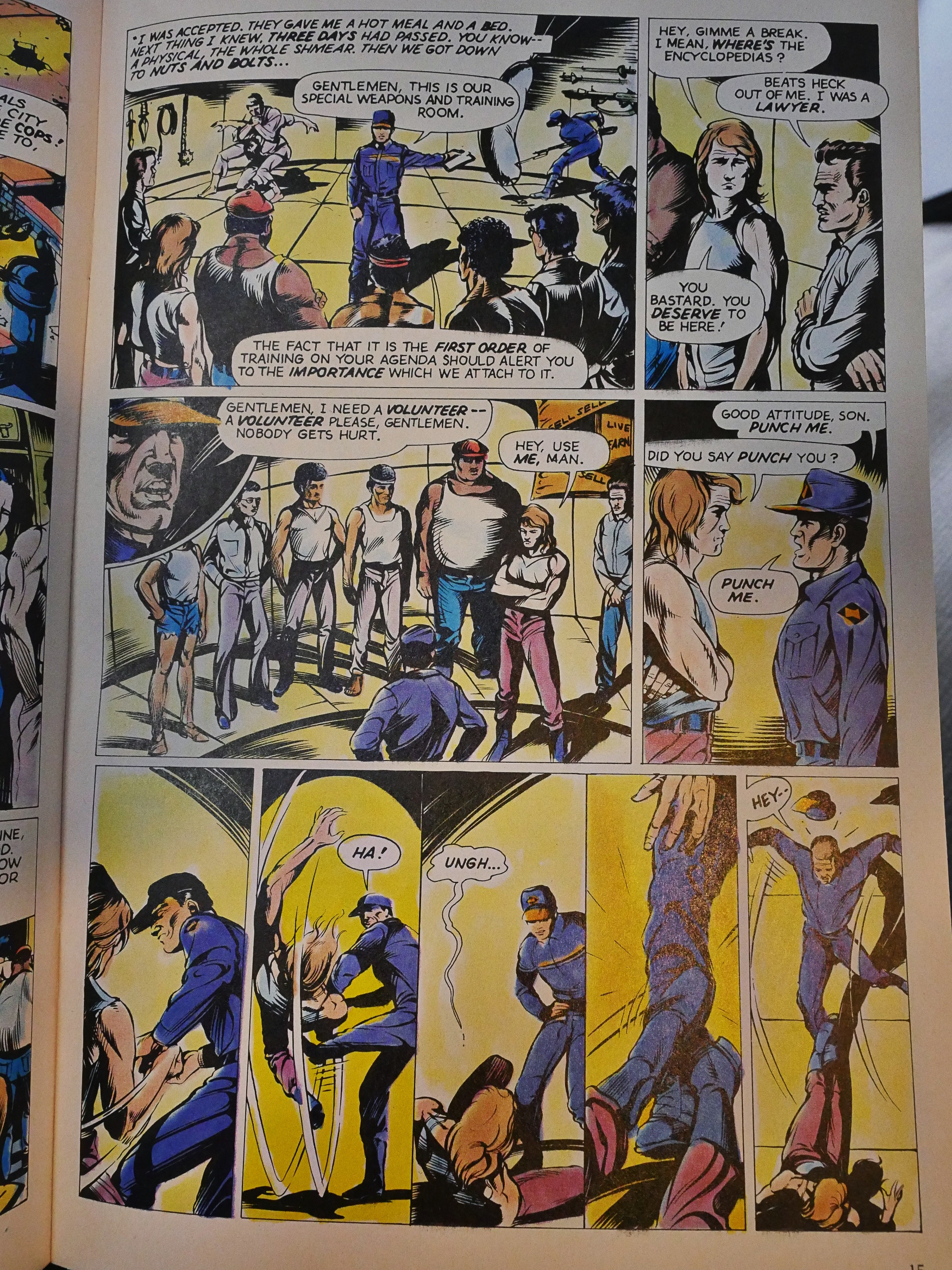
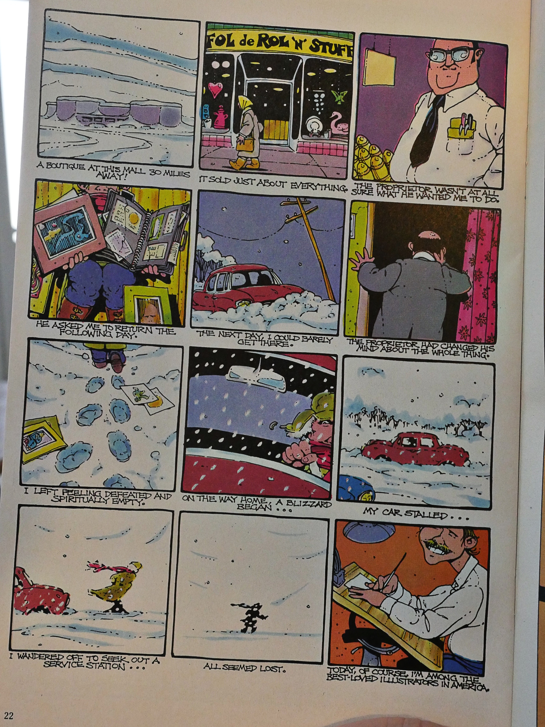
Nexus was pretty popular at the time, so the first four issues reprint an old thing that Mike Baron/Steve Rude did earlier. It’s about a post-apocalyptic encyclopedia salesman. How’s that for high concept.
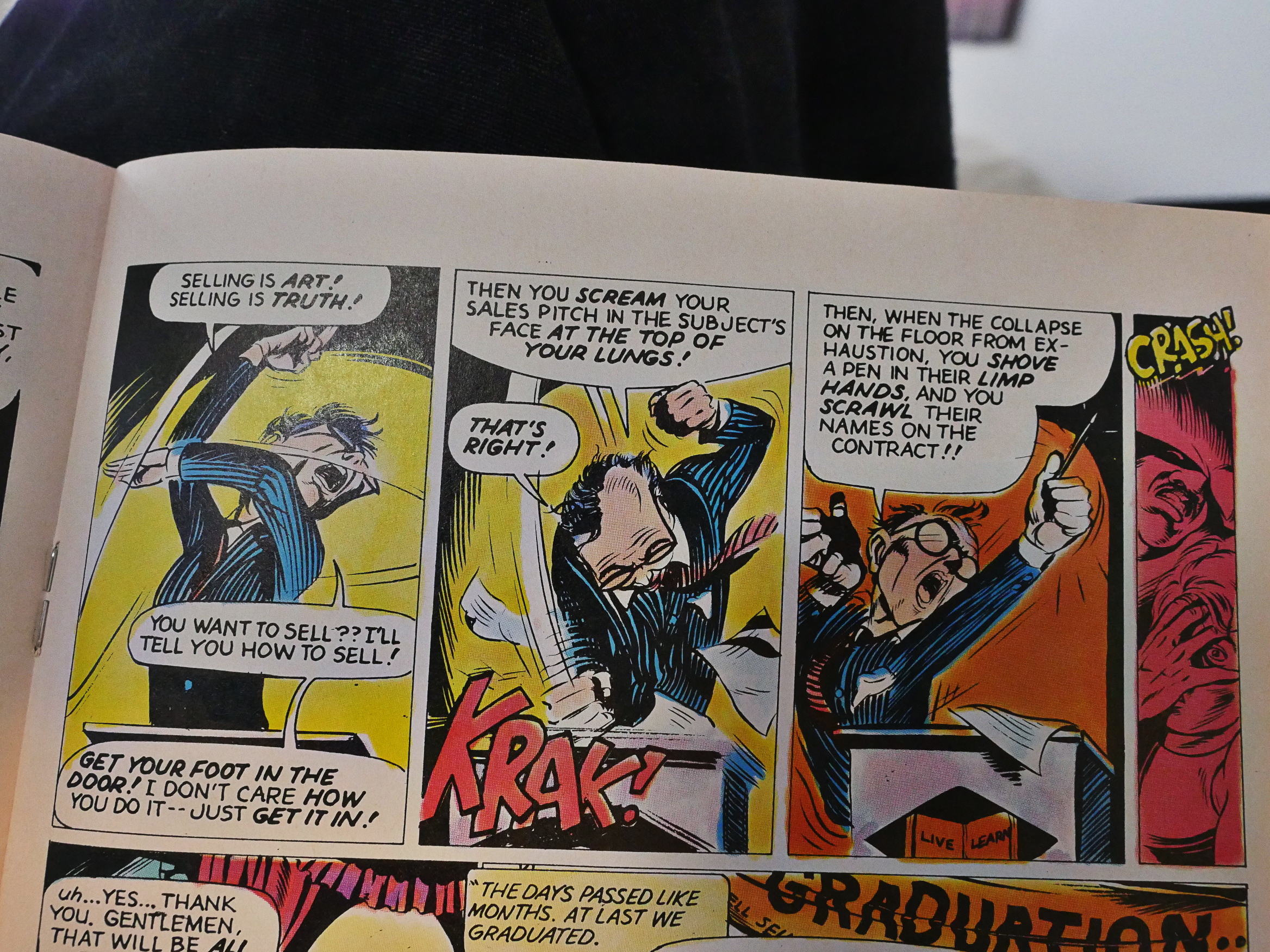
Rude’s artwork is nowhere near how beautiful it would later get, but the story is well told and somewhat amusing. It’s probably the best of the adventure stories in the book.
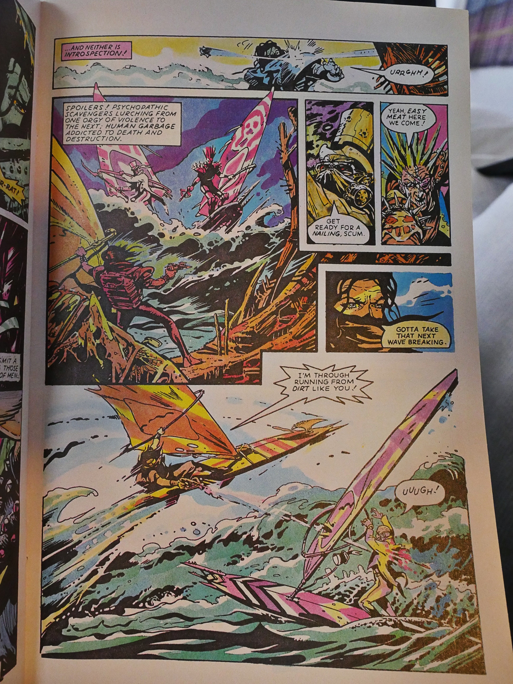
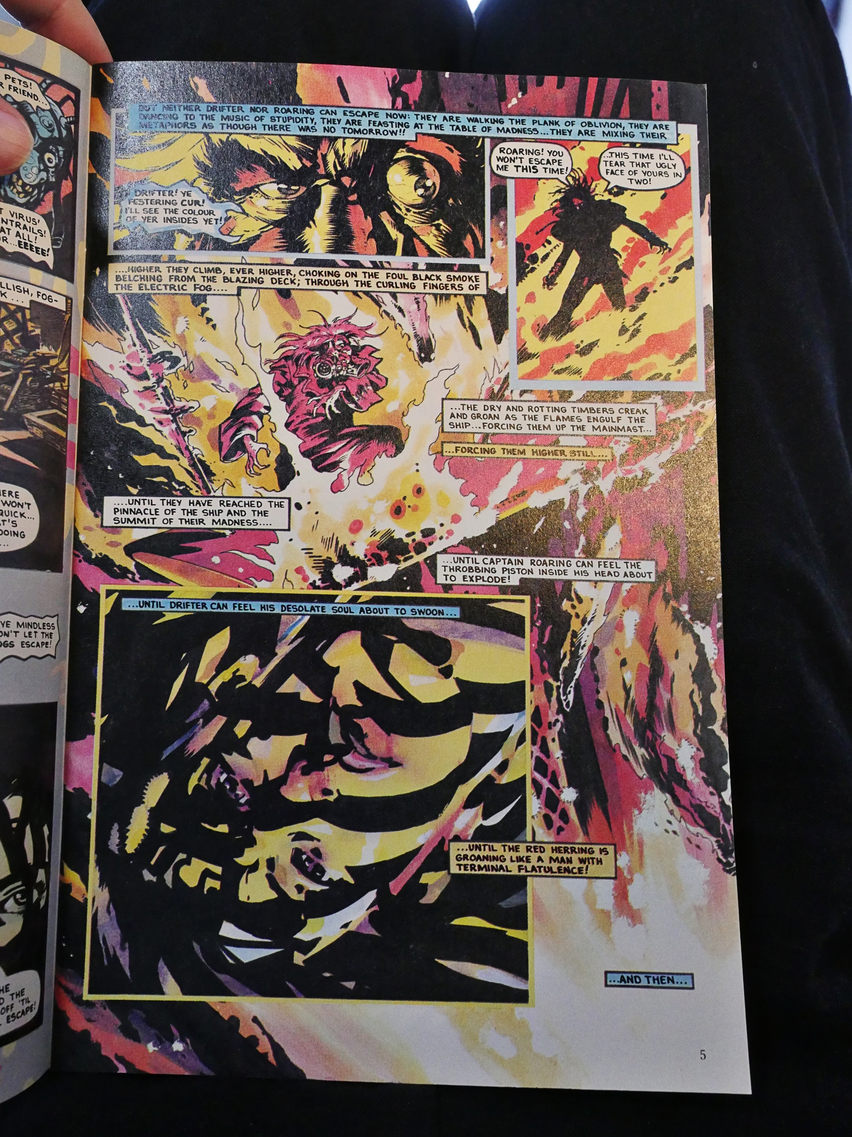
Peter Milligan/Brendan McCarthy’s Freakwave is very British. It reads as if something from Warrior magazine… so it’s pretty incoherent. But it looks nice, especially with all the pinks McCarthy colours with.
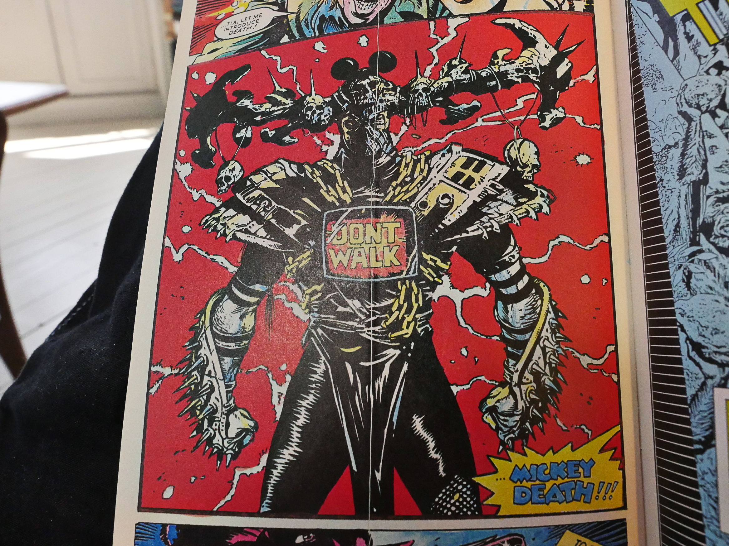
And how can you not love the character design of Mickey Death?

There’s more Campiti in the second issues, this time with Cynthy J. Wood and Bob McLeod. It is basically unreadable. The pacing is so choppy that the only response possible is “eh? eh?”
Quite a few of the newcomers come from the Joe Kubert school, and they real like student work, like this one by Darren Auck. At least I think he’s from the school; I’m not super-motivated to go back and read the introduction. Sorry! Professional’r’me.
In the second part of Freakwave, they didn’t have time to have McCarthy colour is, which is a shame. Looks a lot less coherent with this more traditional colouring.
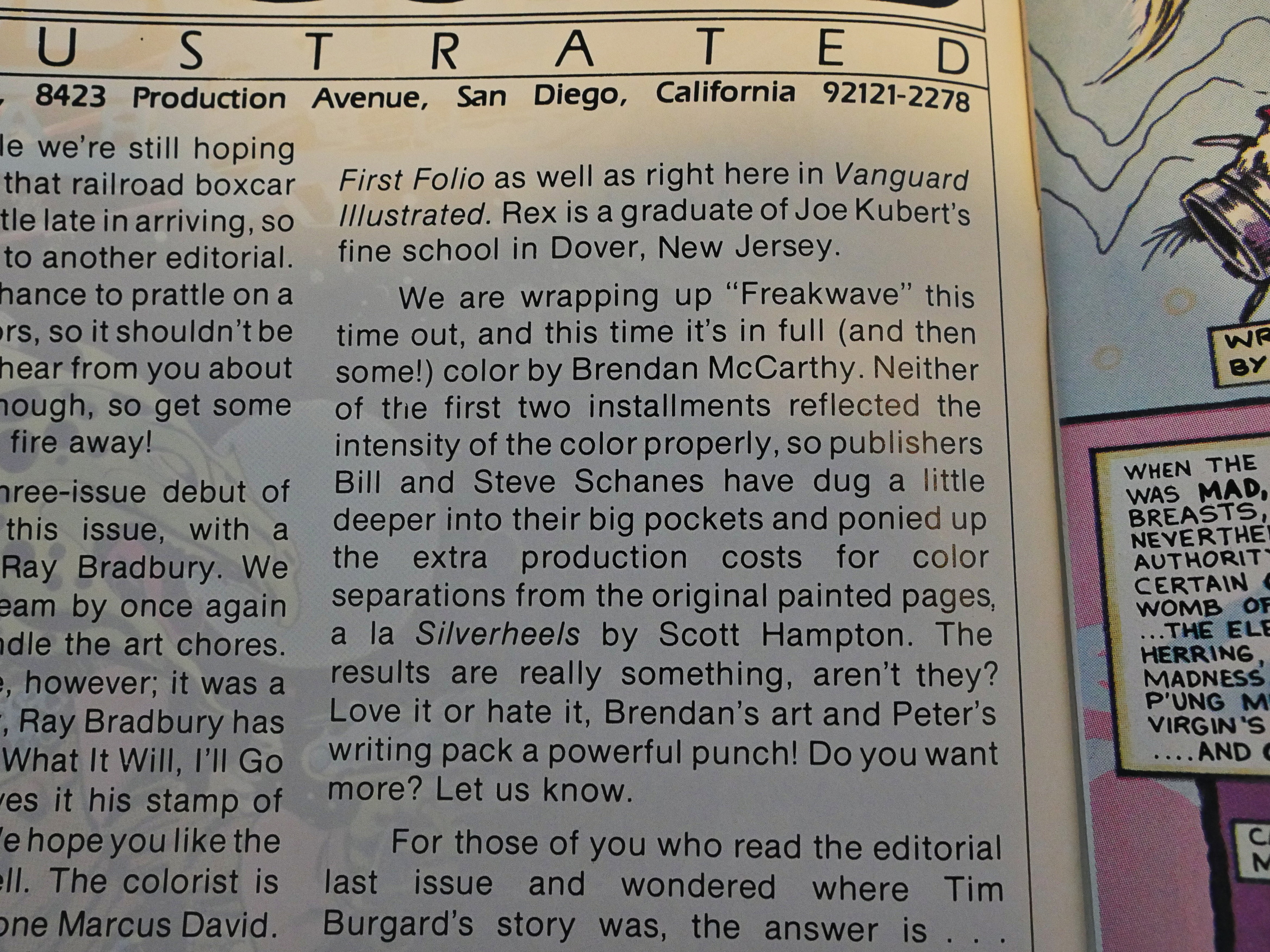
But on the third part they go for full colour seps and McCarthy is back:
Now that’s nice!
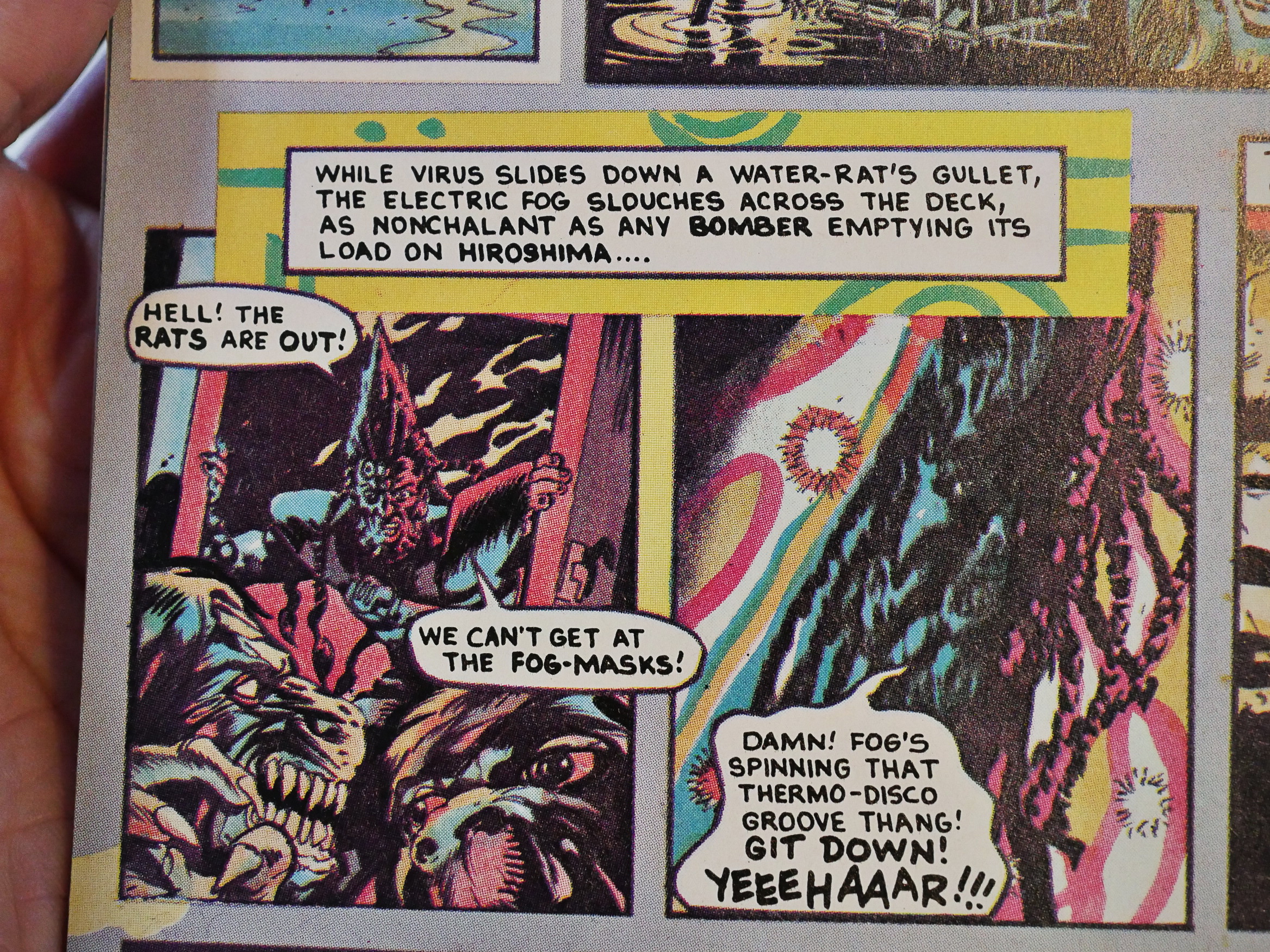
But, basically, the creators seem pretty fed up with the storyline (if you can call it a storyline), and it’s all gibberish. Probably more fun if you’re on meth.
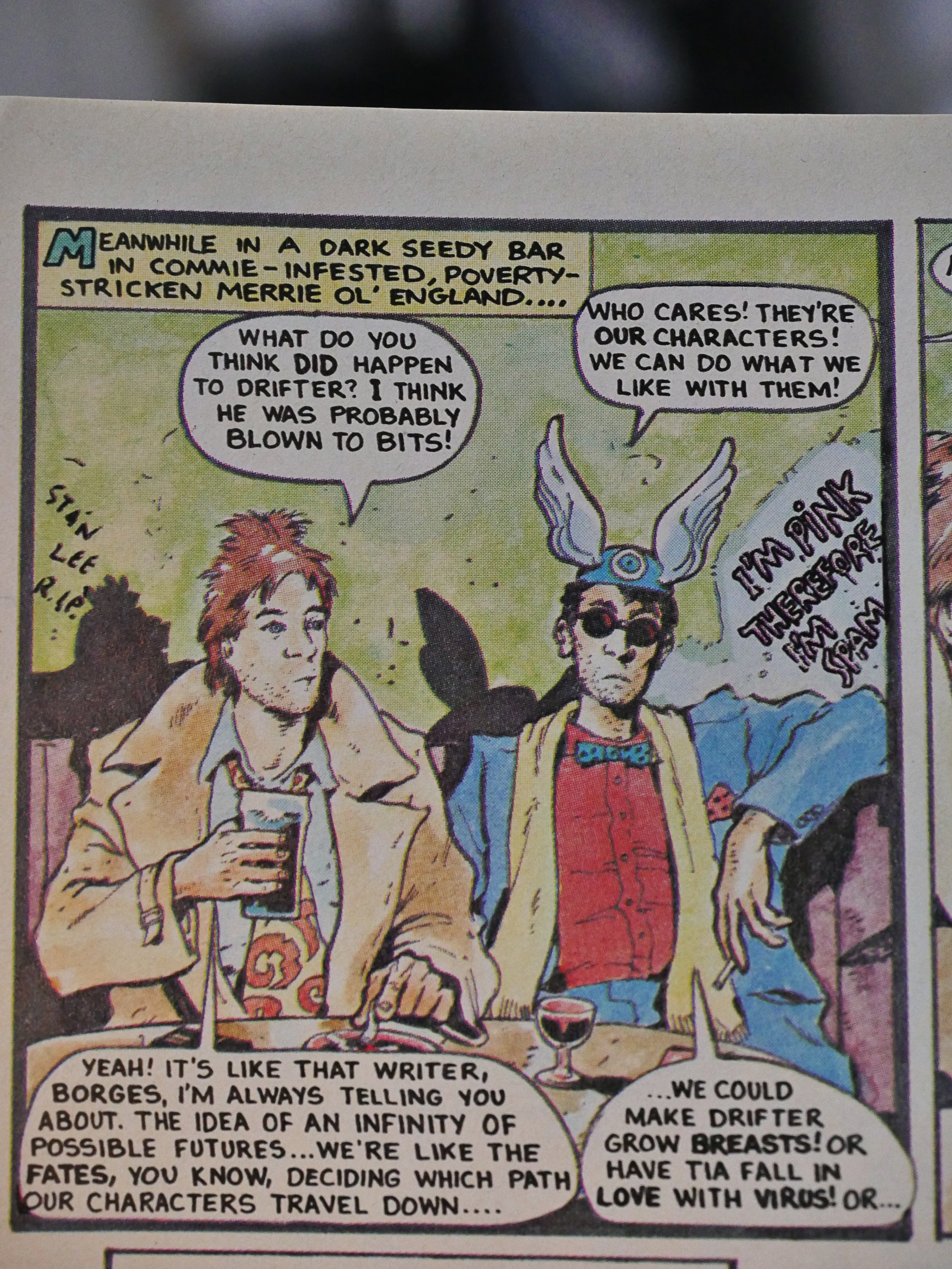
And, indeed, the final page confirms that they just couldn’t be bothered with where this all was going… if it was going anywhere.
But they did continue the series later, to greater success.
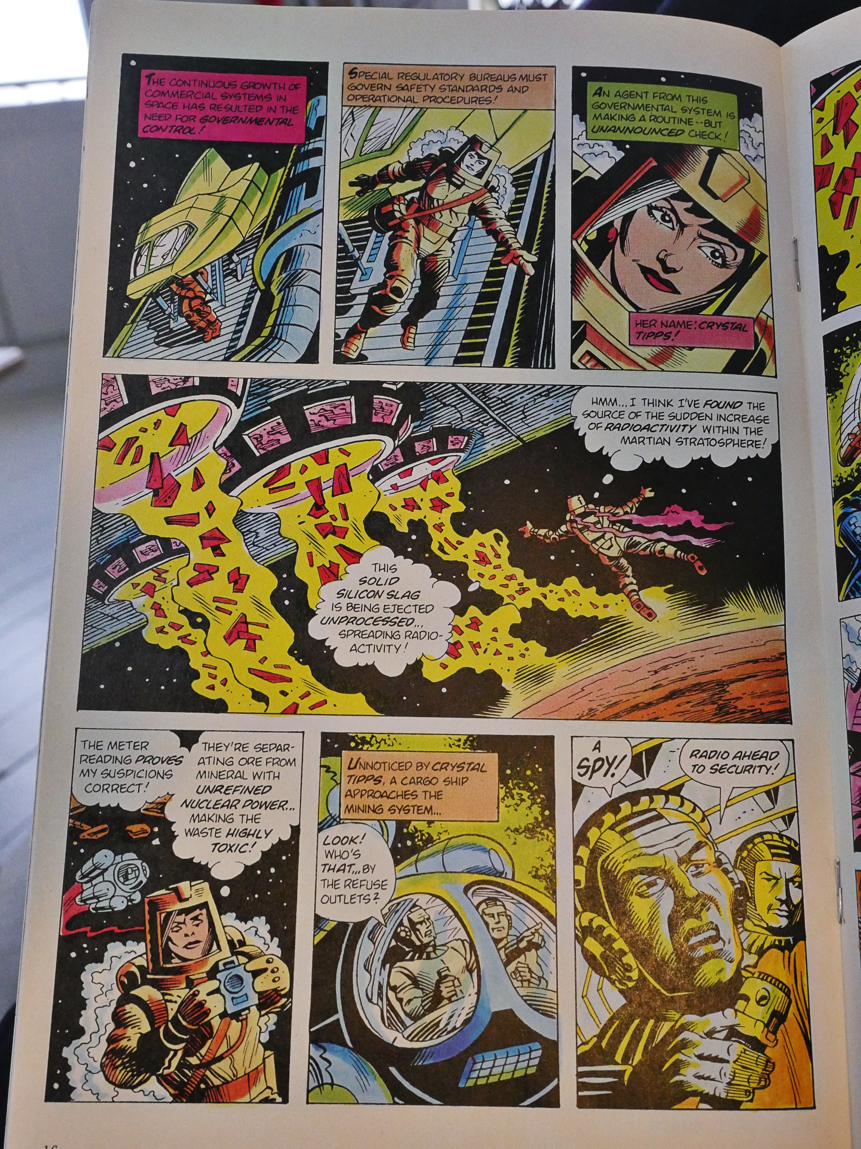
Rex Lindsey does a sci-fi environmentalist thing. You can appreciate the idea, but the artwork isn’t very inspiring. Another Kubert student, I think.
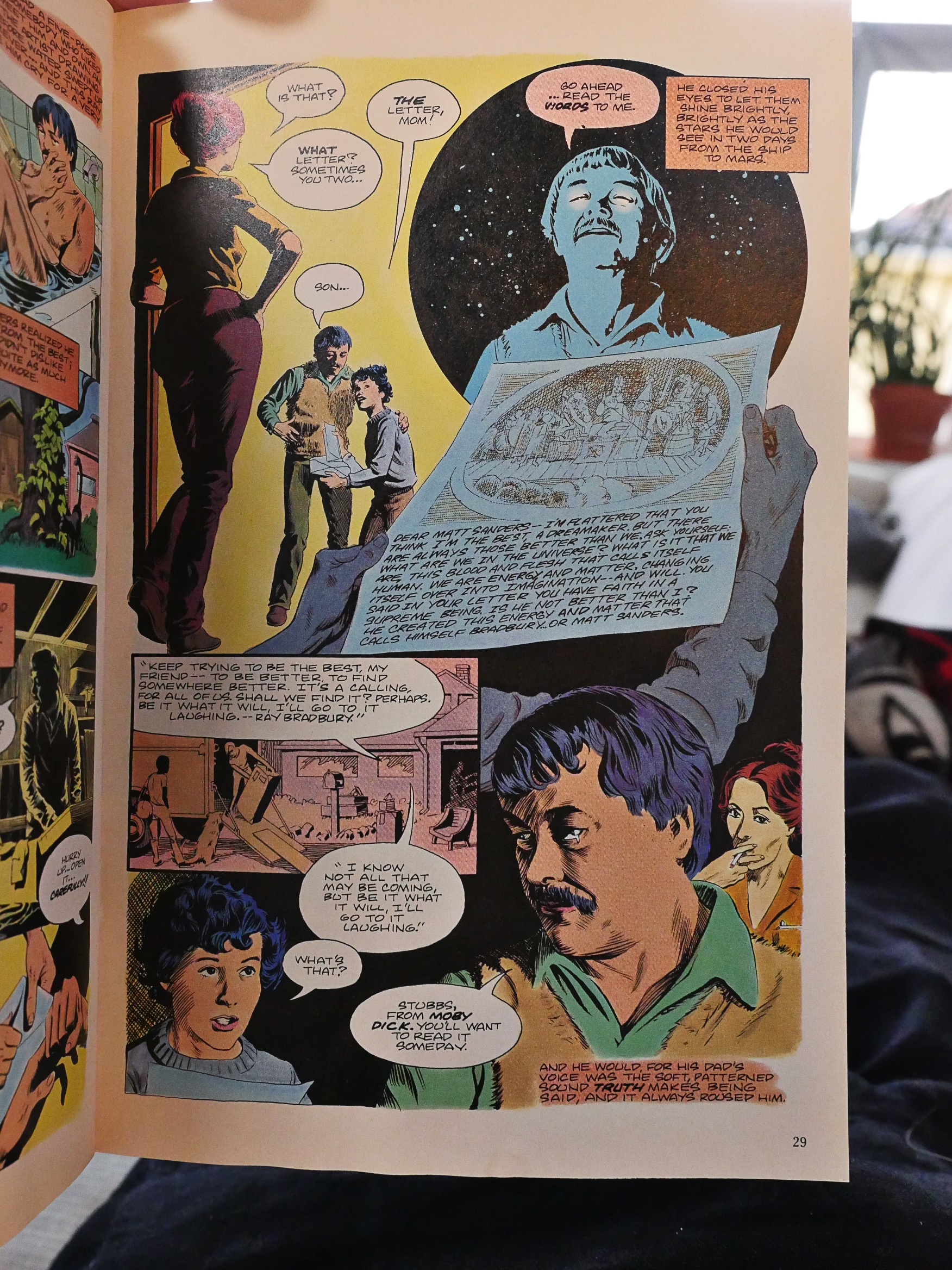
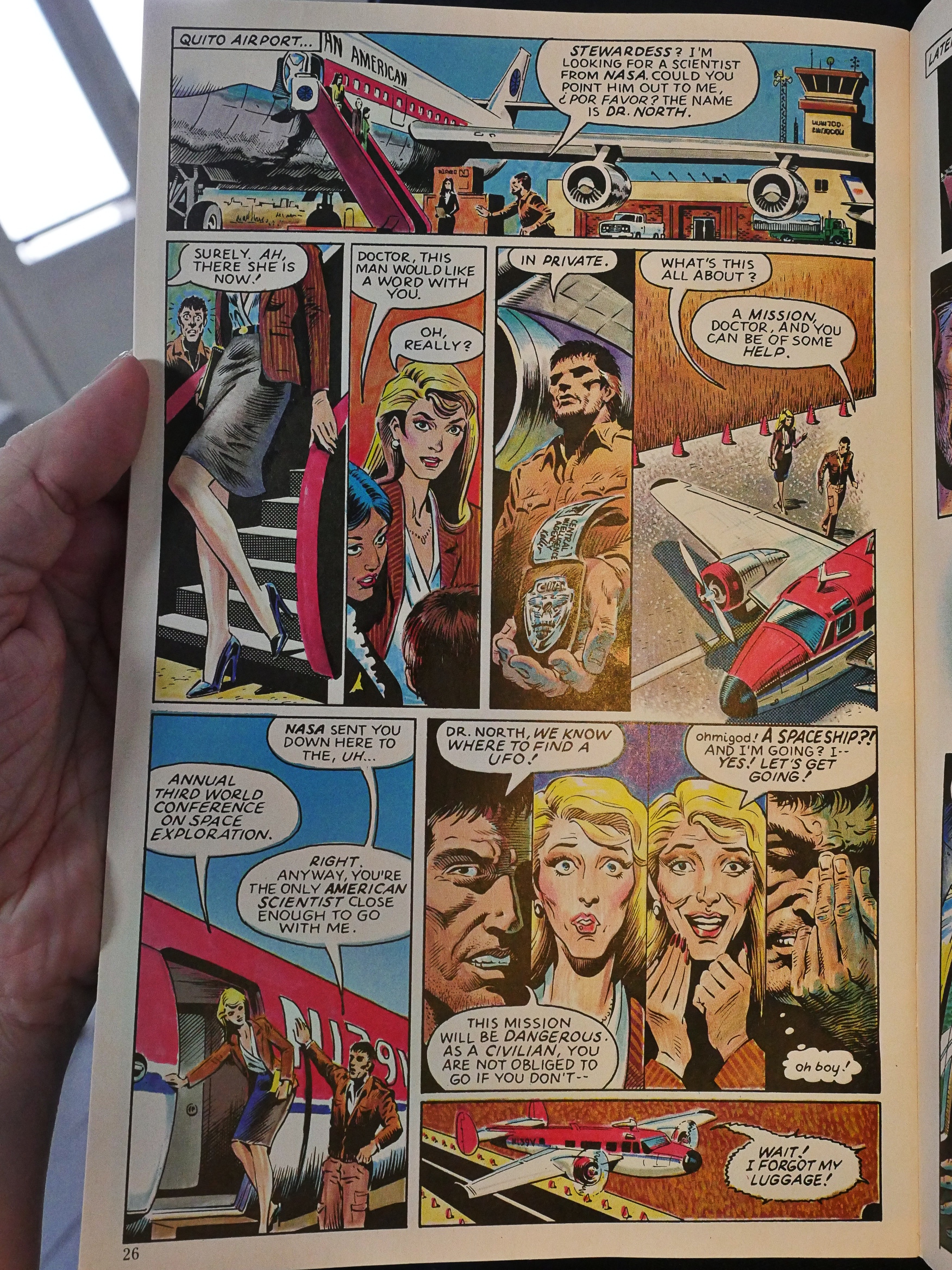
Tom Yeates teams up with Campiti for a story about sending Ray Bradbury to Mars. It gets the elegiac tone of Bradbury’s Martian tales pretty much right, but I don’t think Yeates had much fun drawing it, because he’s really restrained. So it reads well, but it’s hard to get really enthusiastic about it.

I wonder what special deal Pacific had with the Kubert school. Later in this blog series we’ll have a look at something called 1st Folio, which is all student all the time, I believe, but I haven’t re-read it yet.
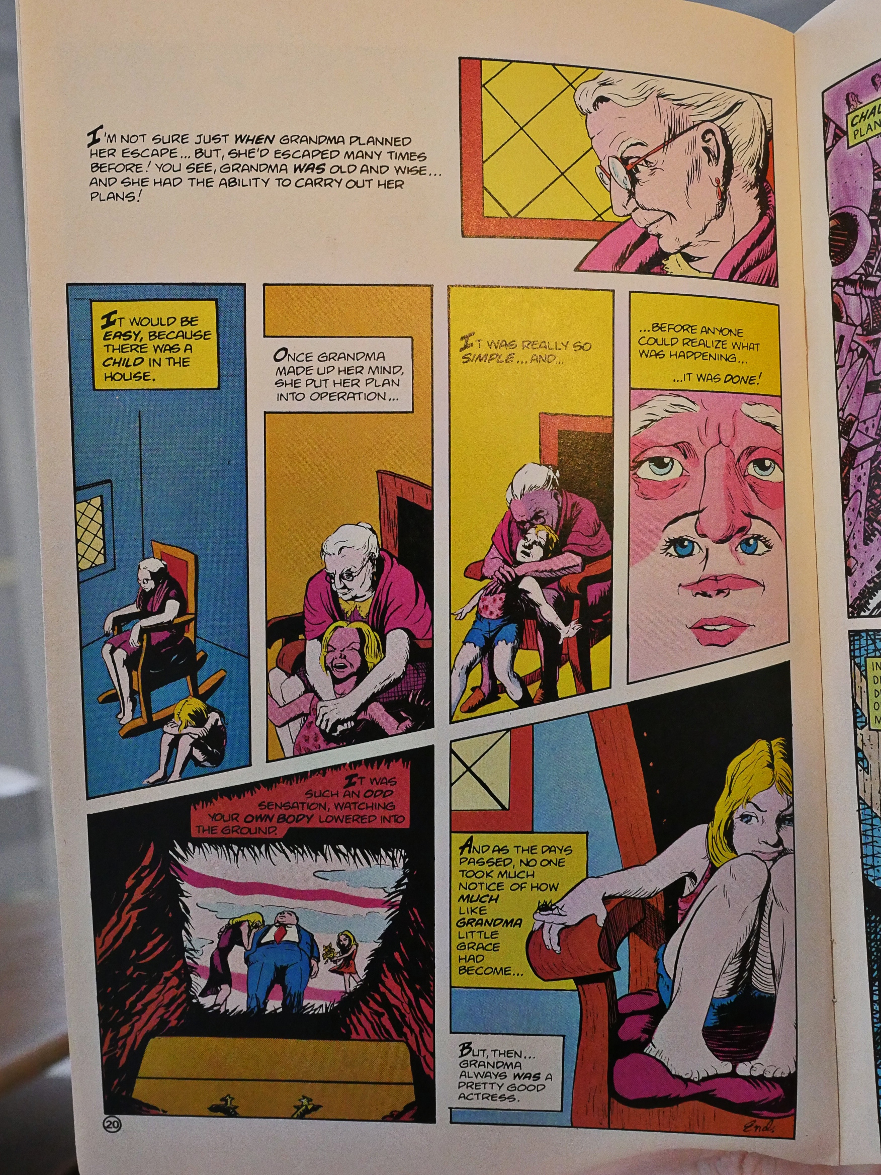
Ruth Raymond does a kinda-sorta horror story… and again, it’s kinda studentey.
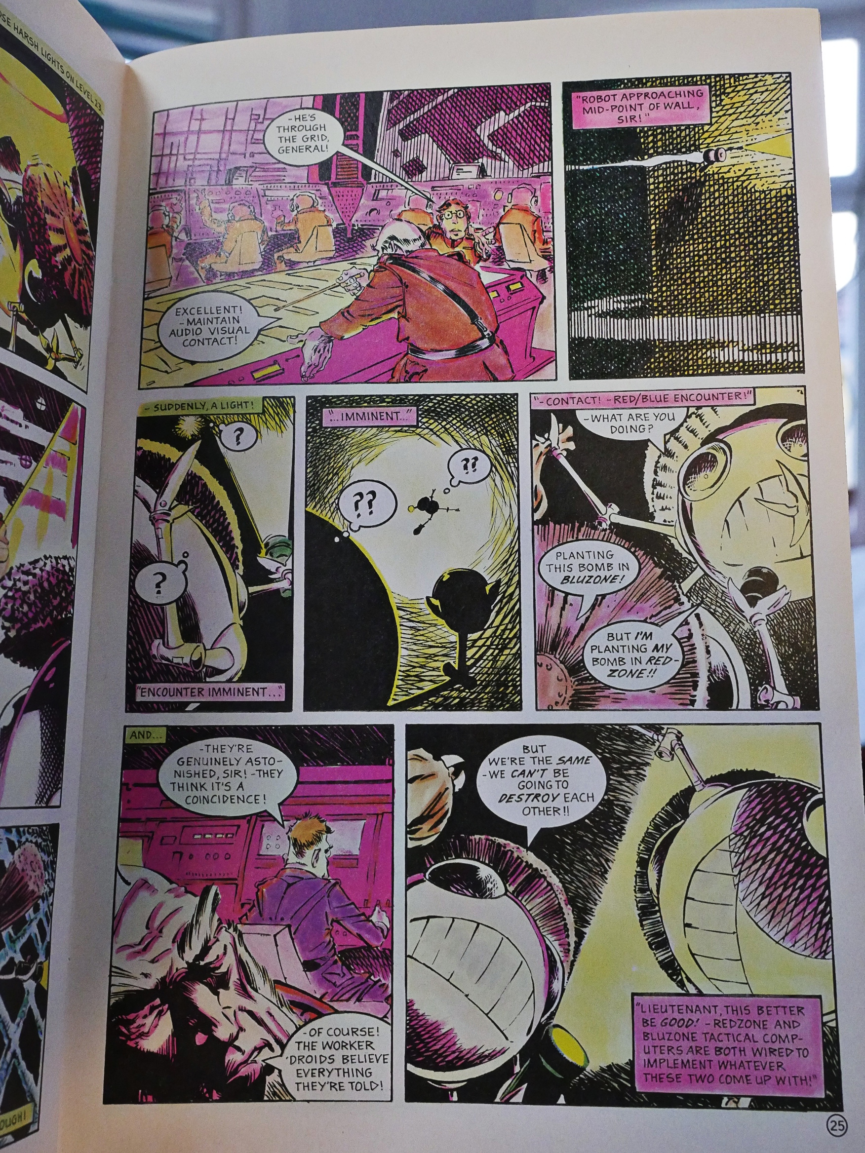
Paul Neary and Mick Austin do a little science fiction story that’s rather original: It’s about two robots deciding to go pacifist (sort of) and the reaction by the rulers. It’s not bad, but it reads kinda choppy. Too much fun with angles wen drawing, perhaps.
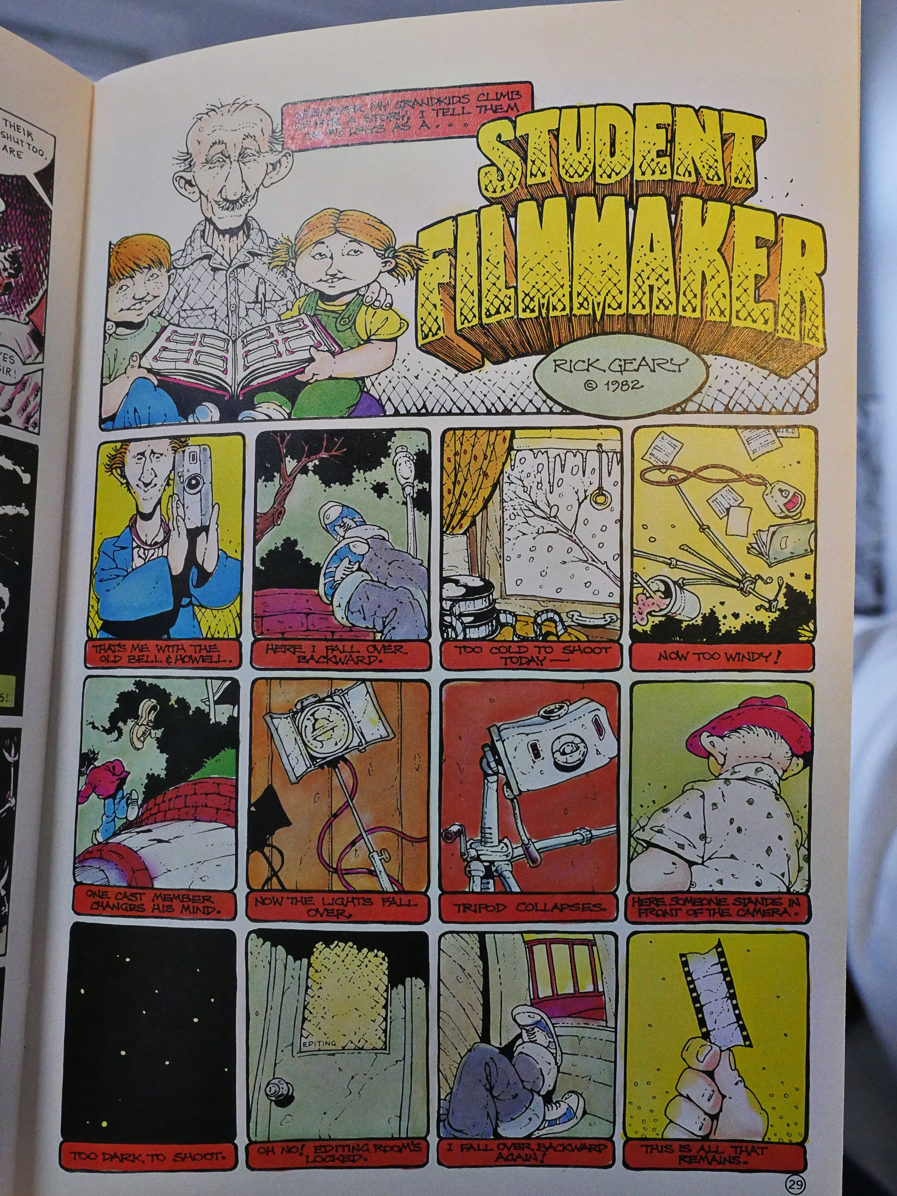
Rick Geary! His two contributions to Vanguard Illustrated are easily the best pieces here.
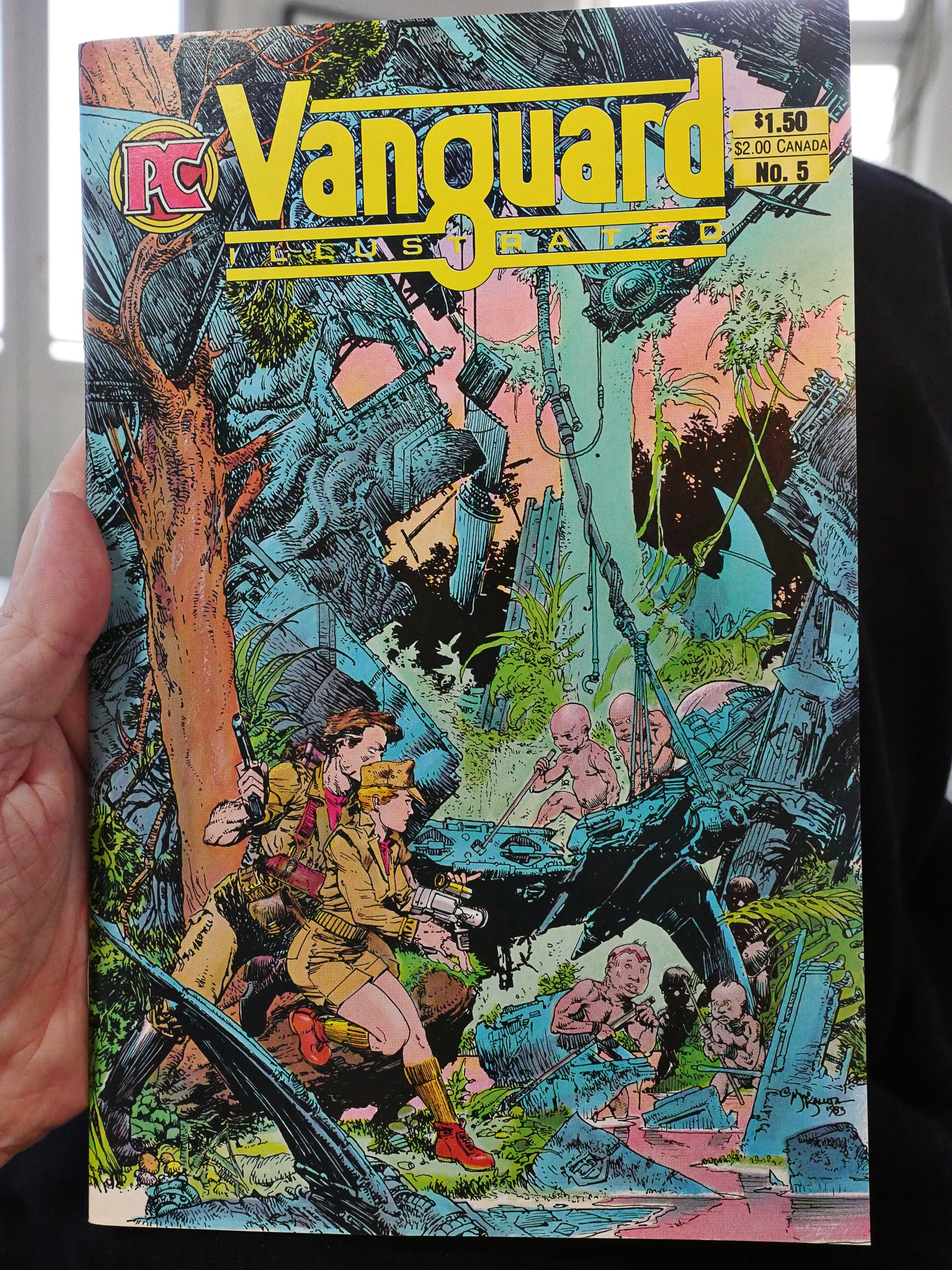
Or perhaps this Michael William Kaluta cover is. Yowza.
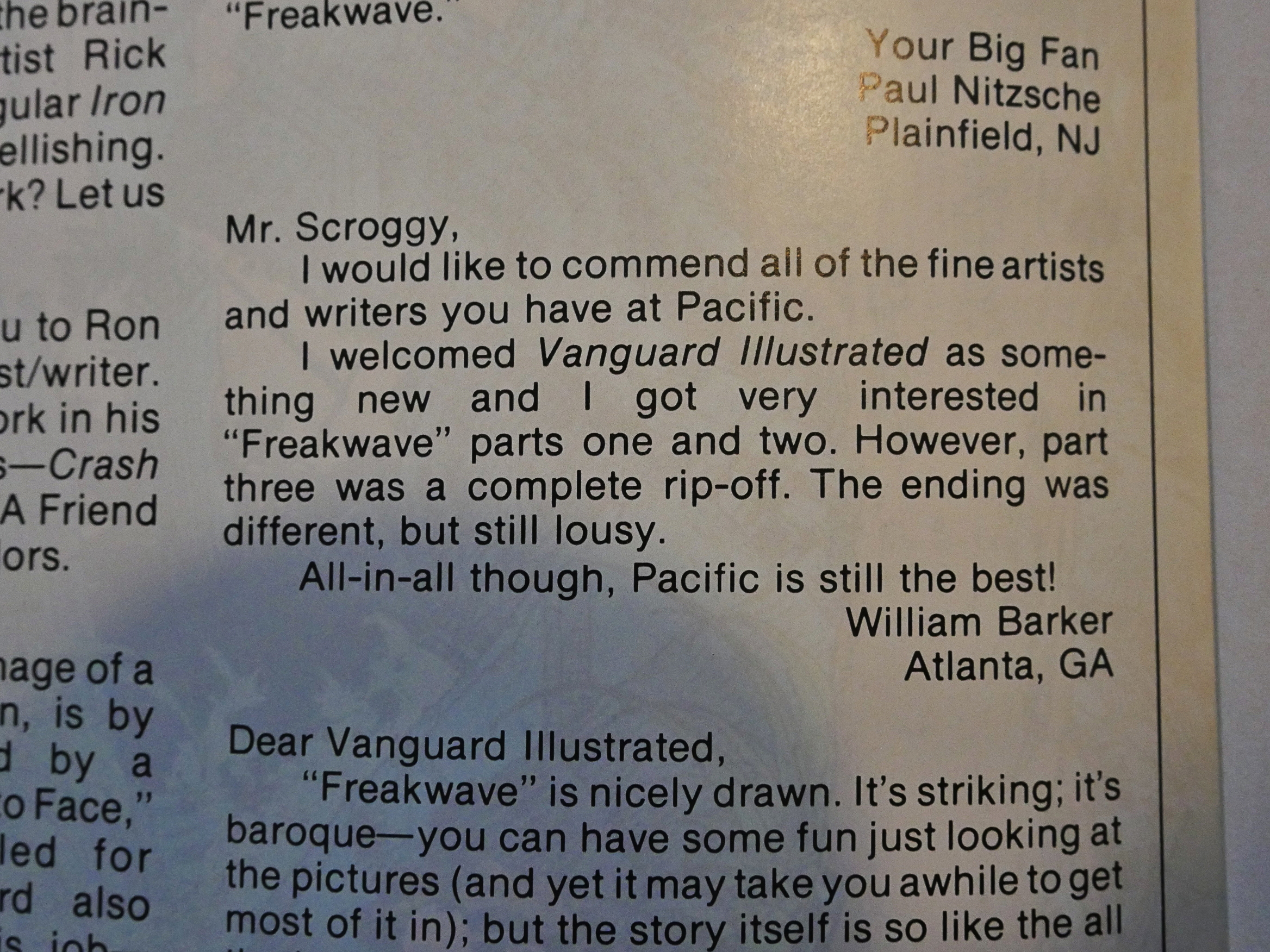
A reader didn’t much care for the metatextual ending to Freakwave.
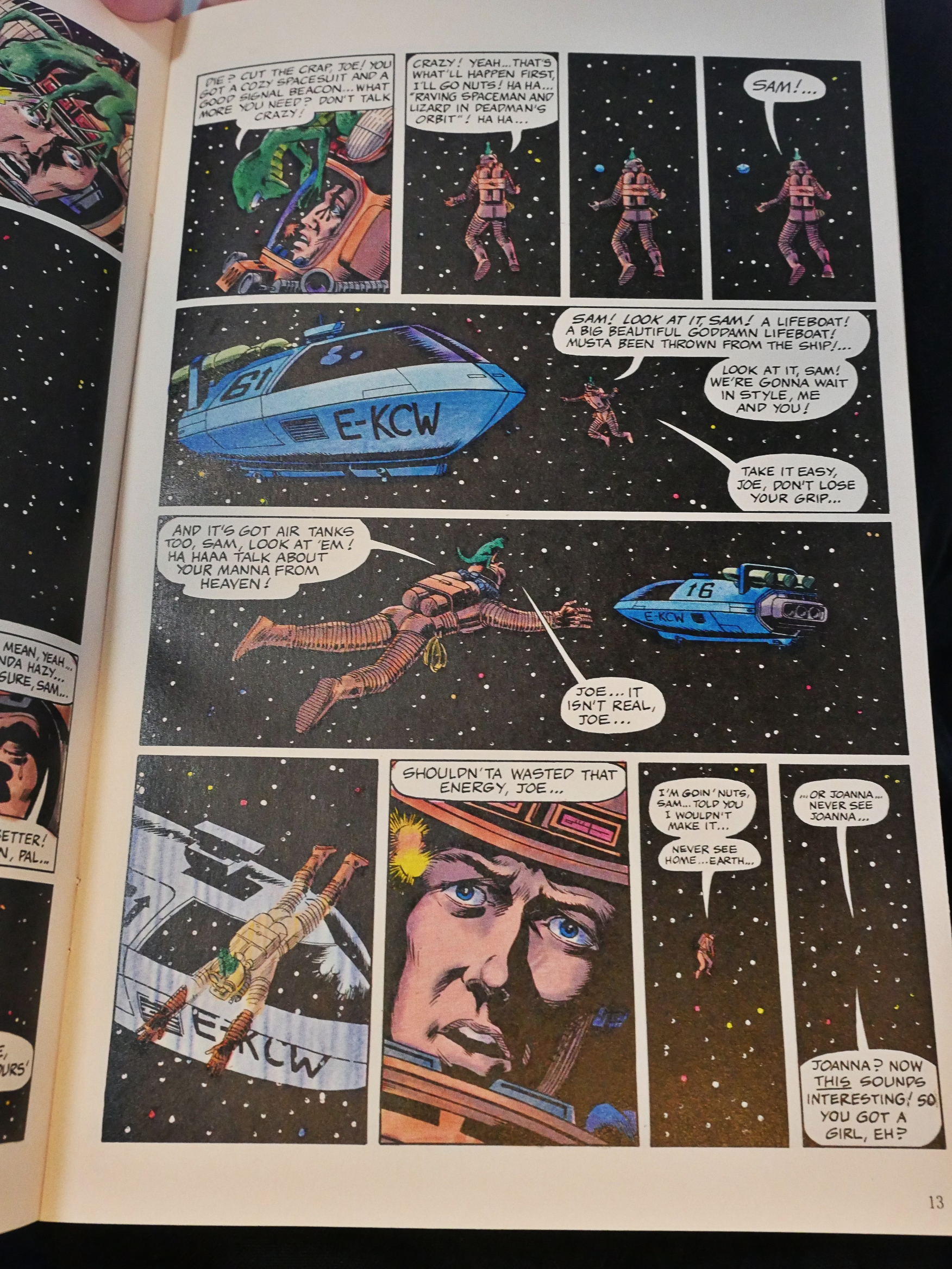
Ron Harris does a sci fi story so standard that you have to ask… why…

Oh, I probably shouldn’t have included both of these Rick Geary pages, should I? He goes all autobiographical. Love it.
Tim Burgard does a sci-fi shaggy dog story that I’m guessing some would find offensive for many different reasons.
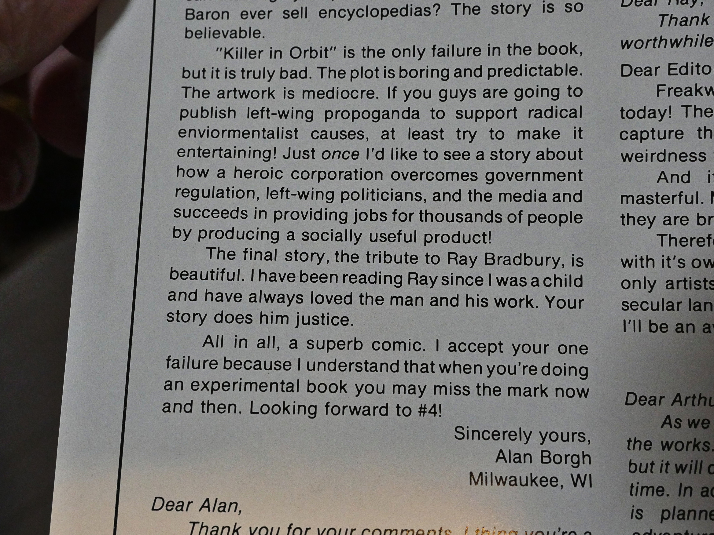
But not as offensive as the “radical” environmental sci-fi story, which just goes to show that the alt right pearl clutching that happens every time there’s a political comic book out there isn’t something new.

I wonder whether he liked the next story by the same artist any better: The villain there is a preacher.
(From outer space.)
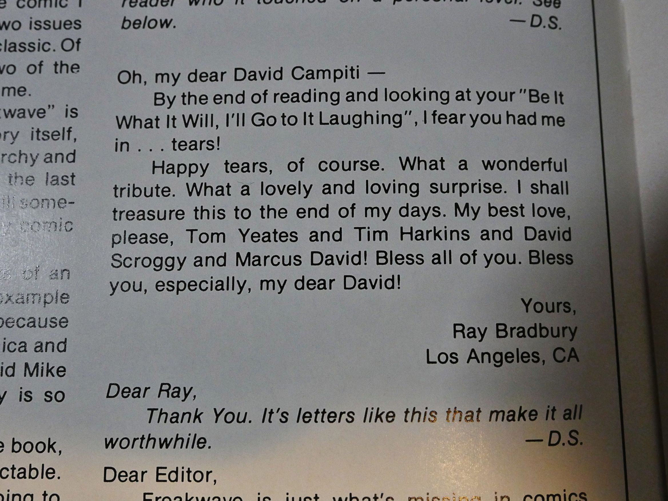
Wow! Ray Bradbury writes in to let them know he quite liked the Mars story.
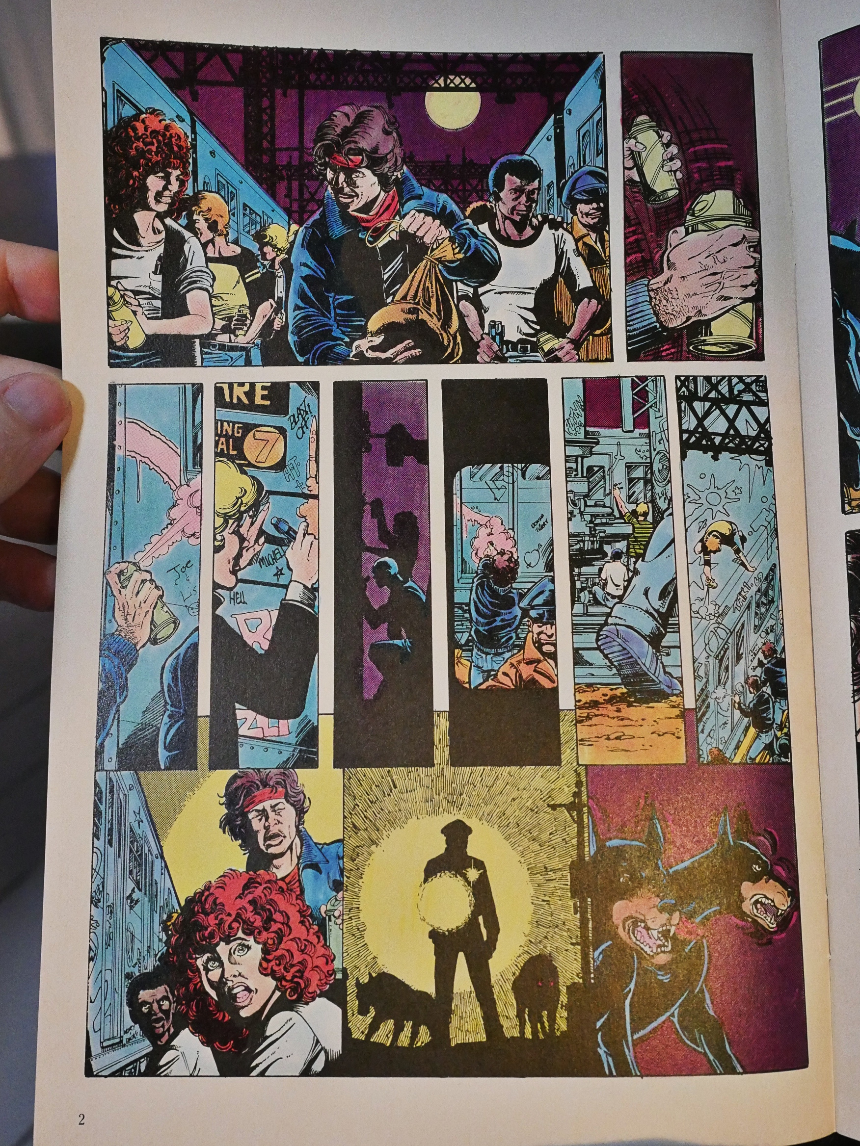
Joey Cavaleri and George Perez do a rare wordless story about how cool it is to spray-paint subway cars. It’s unexpected.
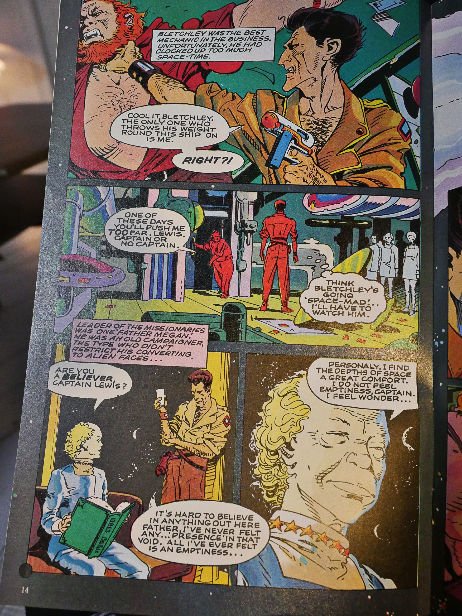
Peter Milligan teams up with George Freeman (unexpected choice) for a sci-fi story about how Christianity is nice and stuff (at least I think that’s the point). It’s an odd story structurally: The ending seems to come from nowhere, and the setup with that red-headed guy seems rather unnecessary.
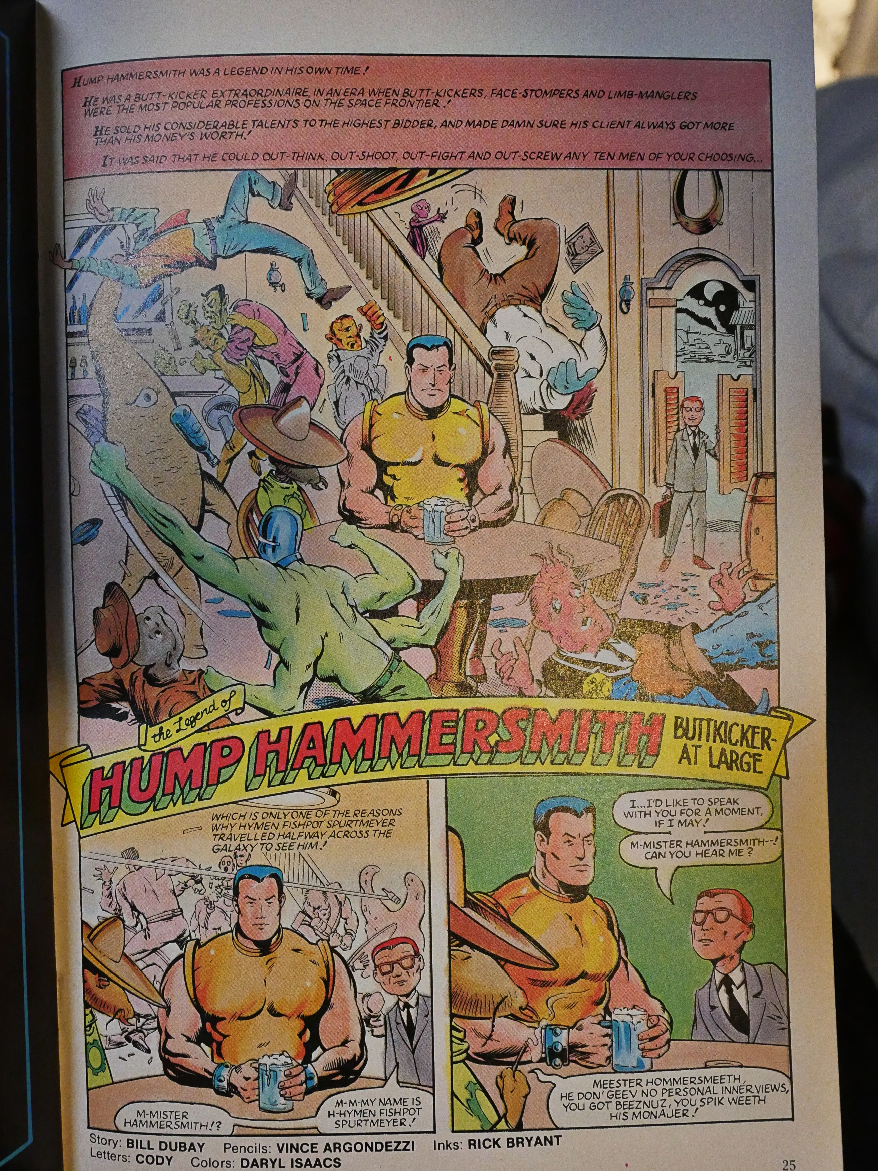
Bill Dubay, Vince Argondezzi and Rick Bryant do an ironic sci-fi swashbuckler thing which starts out well enough…
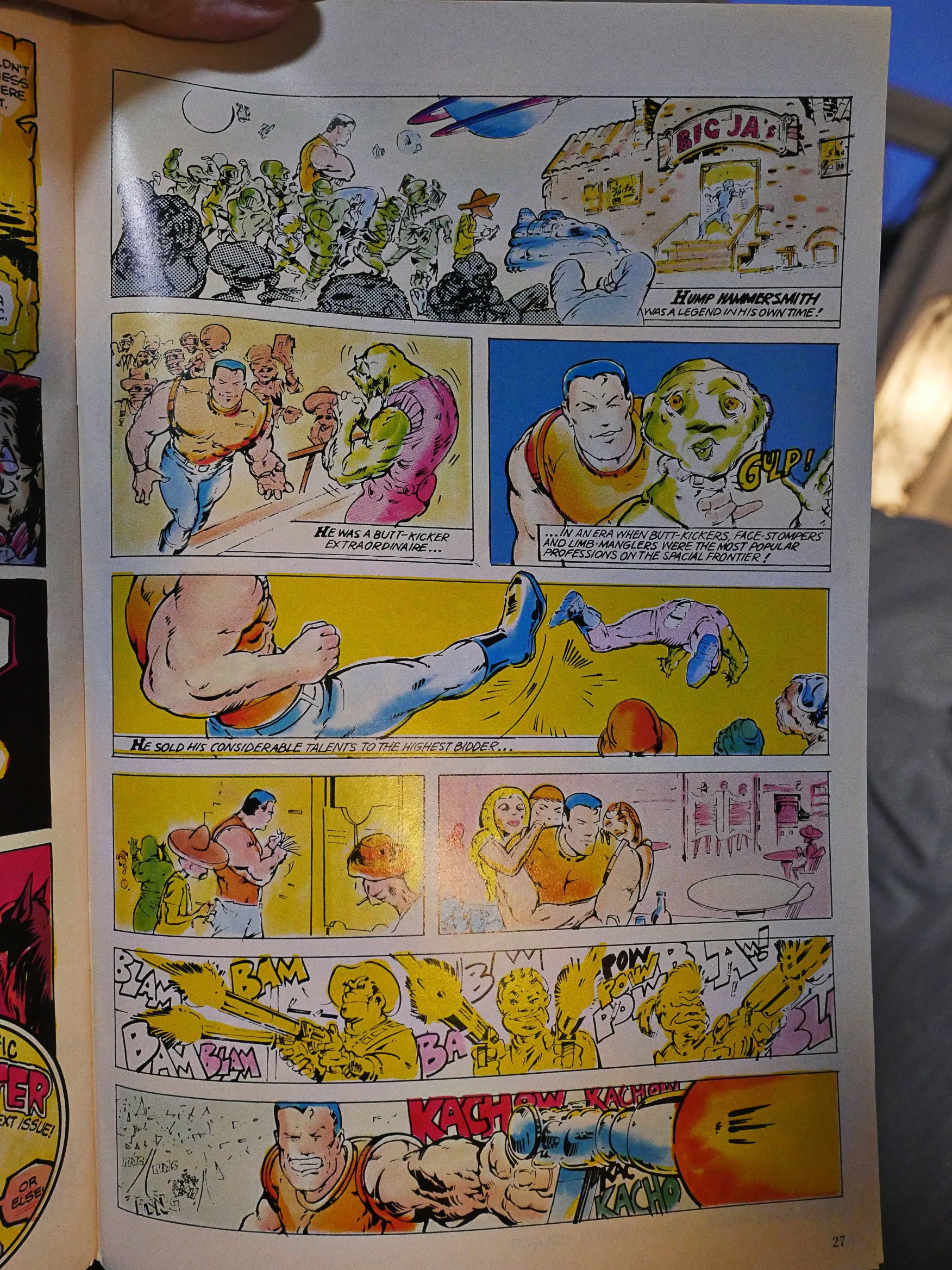
… but then in the second part (which editor Scroggy says was inked in three days due to scheduling), everything becomes virtually unreadable. It’s just horrible-looking.
The seventh and final issue is printed on thin, very shiny paper. I wonder whether that had anything to do with the cash flow issues Pacific were suffering? Perhaps they were moving their comics to a different printer to get more credit or something? Just guessing.
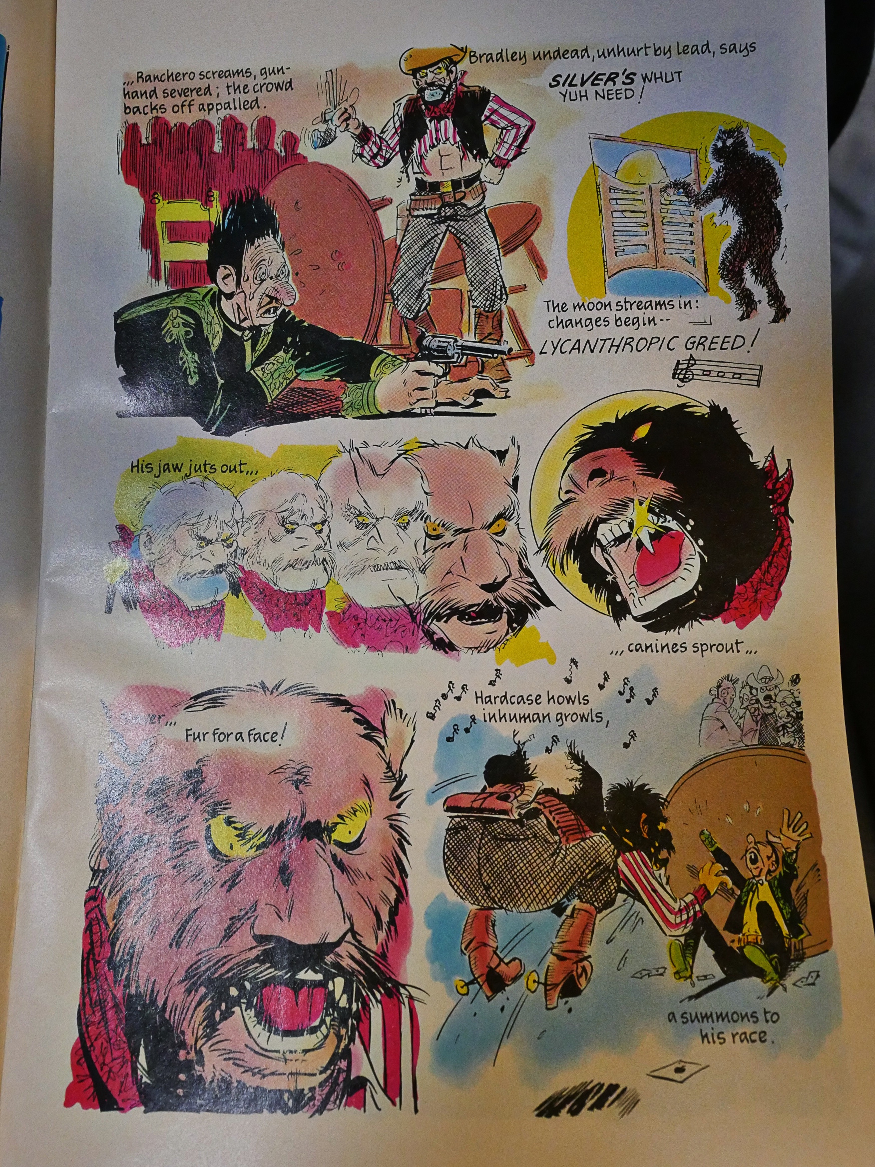
Anyway, this western werewolf story by Stephen Perry and EC Comics veteran George Evans is … not good? I think that’s a way to put it.
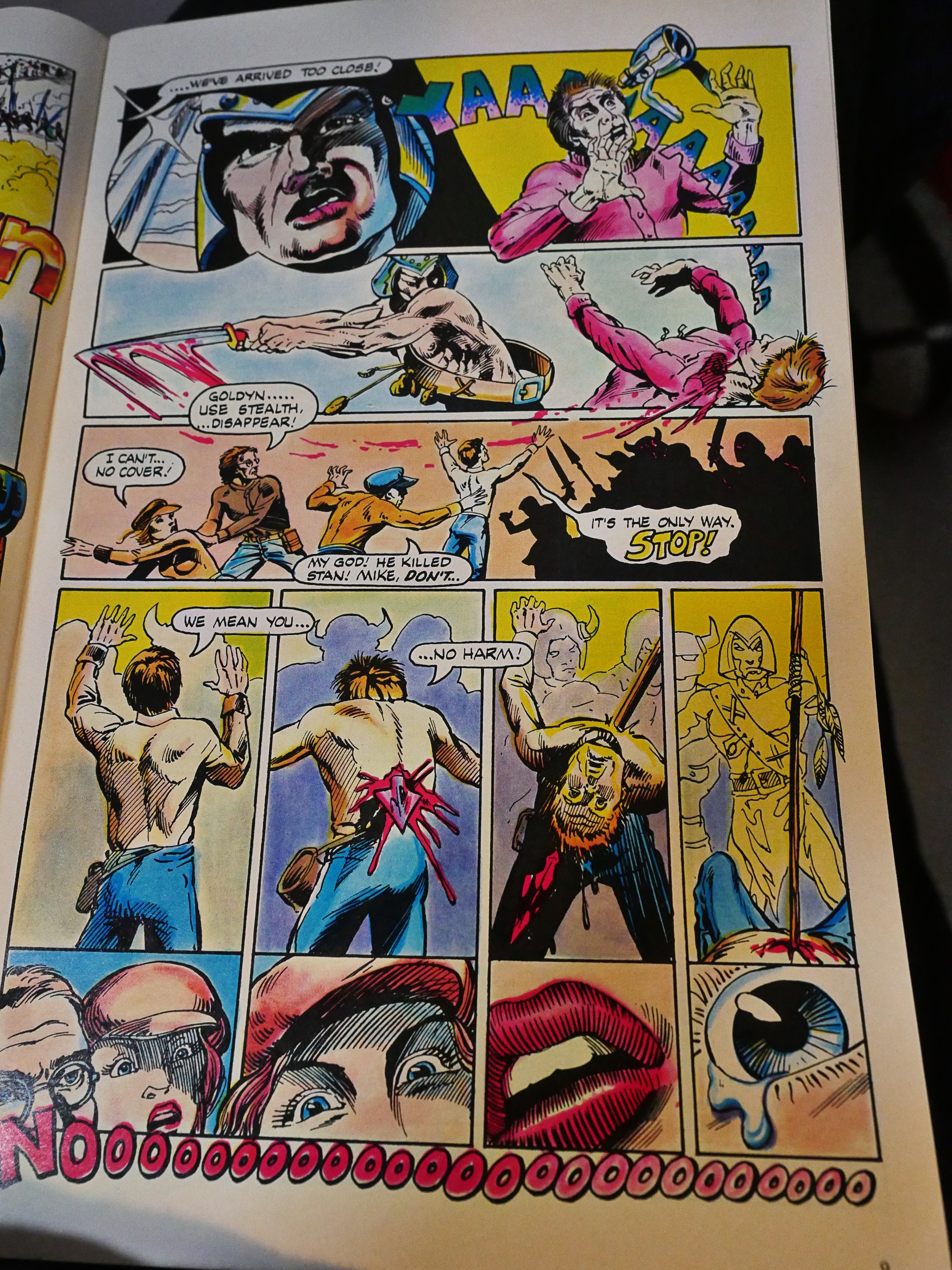
But not as bad as the one by Walter Stuart and Mike Gustovich, which is pointless and ugly.
Fortunately not.
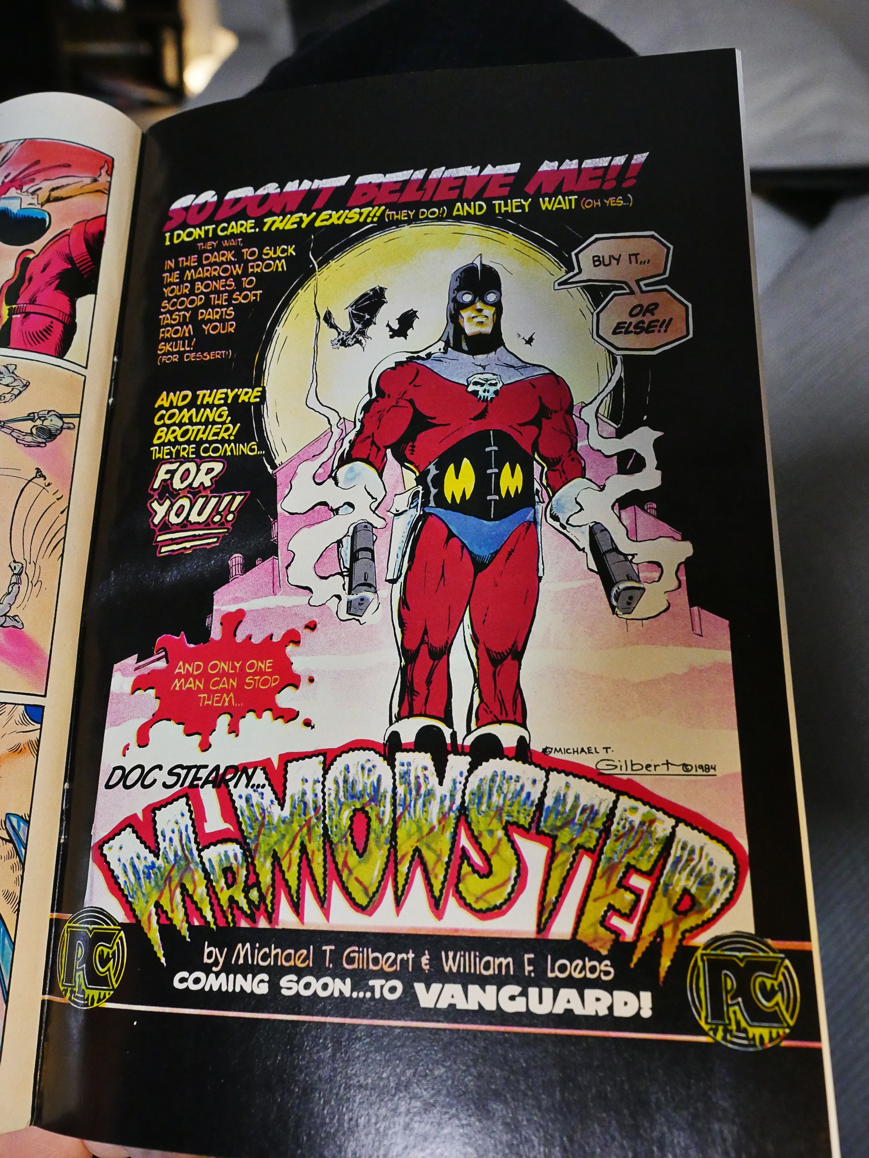
So, there’s an ad for Mr. Monster, soon to be appearing in Vanguard (and we’re reading Vanguard), so that’s confusing.
And then it appears two pages later. Production snafu or deliberate joke? You be the judge.
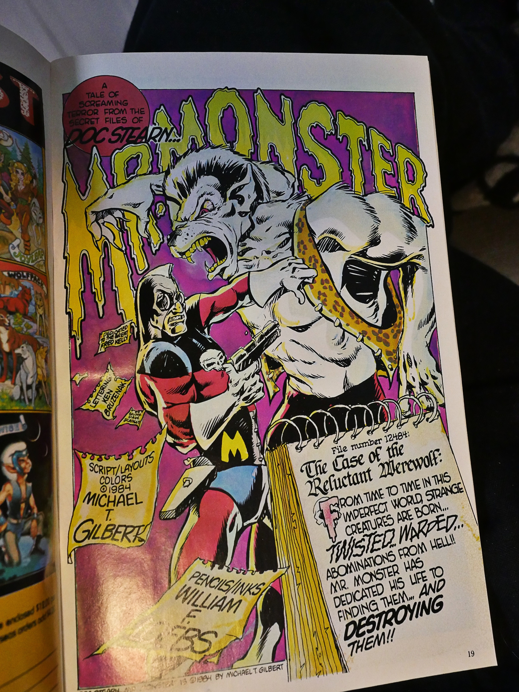
The Mr. Monster story by Michael T. Gilbert and William Loebs is fun, and was reprinted by Eclipes.
I think Vanguard Illustrated probably succeeded in what Pacific wanted it to do: To try out new writers and artists, and also to just have some product to sell to increase the cash flow. But it’s not really a good anthology, as you may have surmised from my less-than-enthusiastic comments here. There’s some amateurish work in here, and the veterans are not working to their full abilities, either.
I was unable to find any reviews, either contemporaneous or later, of this anthology, so I guess nobody found it very interesting.
I loved this comic. made a big impact on me when i was 13. this and Twisted Tales that came out about the same time. From the art to the stories, even down to the paper they printed on was all fresh for that time. great memories.