The Complete Pacific Comics Re-Reading Blog Series presents:
Elric
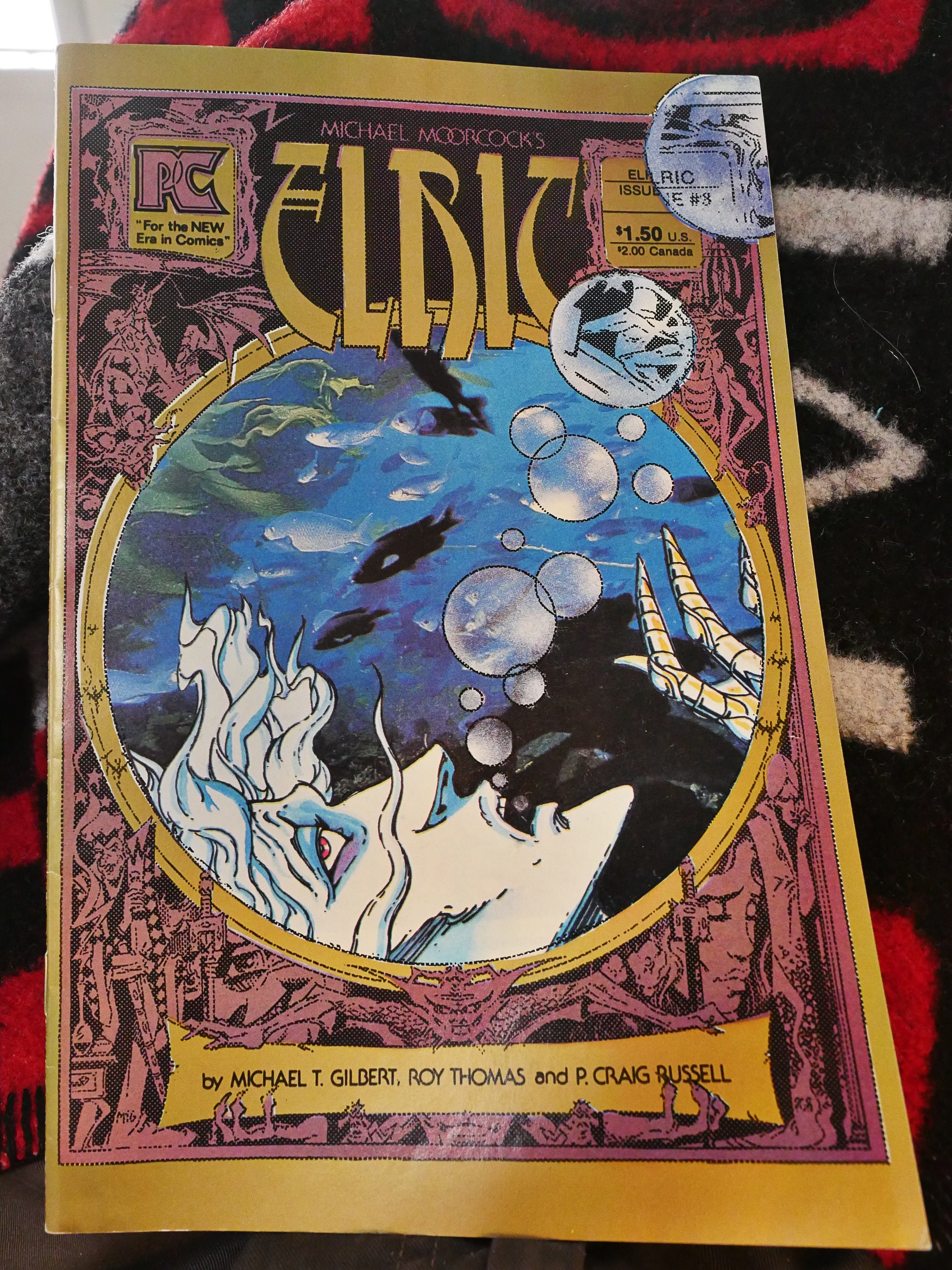
by Roy Thomas, P. Craig Russell and Michael T. Gilbert
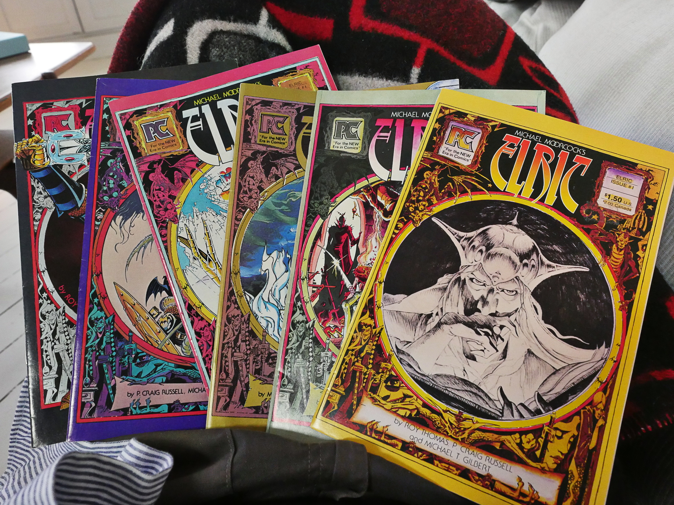
Elric (1983) #1-6

I bought these comics at the time because I was really into P. Craig Russell’s artwork. I like fantasy just fine, but the sword and sorcery sub-genre just bored me silly. So I know nothing about Elric or Michael Moorcock (who wrote the novel this is adapted from), but I always assumed that Elric was a parody/commentary on Conan. Where Conan was swarthy, powerful, semi-naked, Elric is pale, weak and very fully clothed. Even the name “Moorcock” seems to be an allusion to Robert E. Howard, who was a very nerdy recluse, writing these barely-sublimated fantasies of sex and violence.
But I know nothing about him, so that’s all conjecture. And I’m still not, all these years later, interested enough to look it all up. Perhaps that’s even his real name?
I do remember liking these comics quite a bit, though. Let’s have a look.
Mike Friedrich (agent/”packager”) for the book provides the introduction.
The ads say that this issue is published on “baxter” (i.e., a thick white matte paper), but it looks more like “mando” to me. Or perhaps the paper has just yellowed of the years.
The printing is really muddy and ugly. There are virtually no clear black lines anywhere: All the linework looks smudged. It’s like if they’re printing all the different colours in addition to black over the linework?
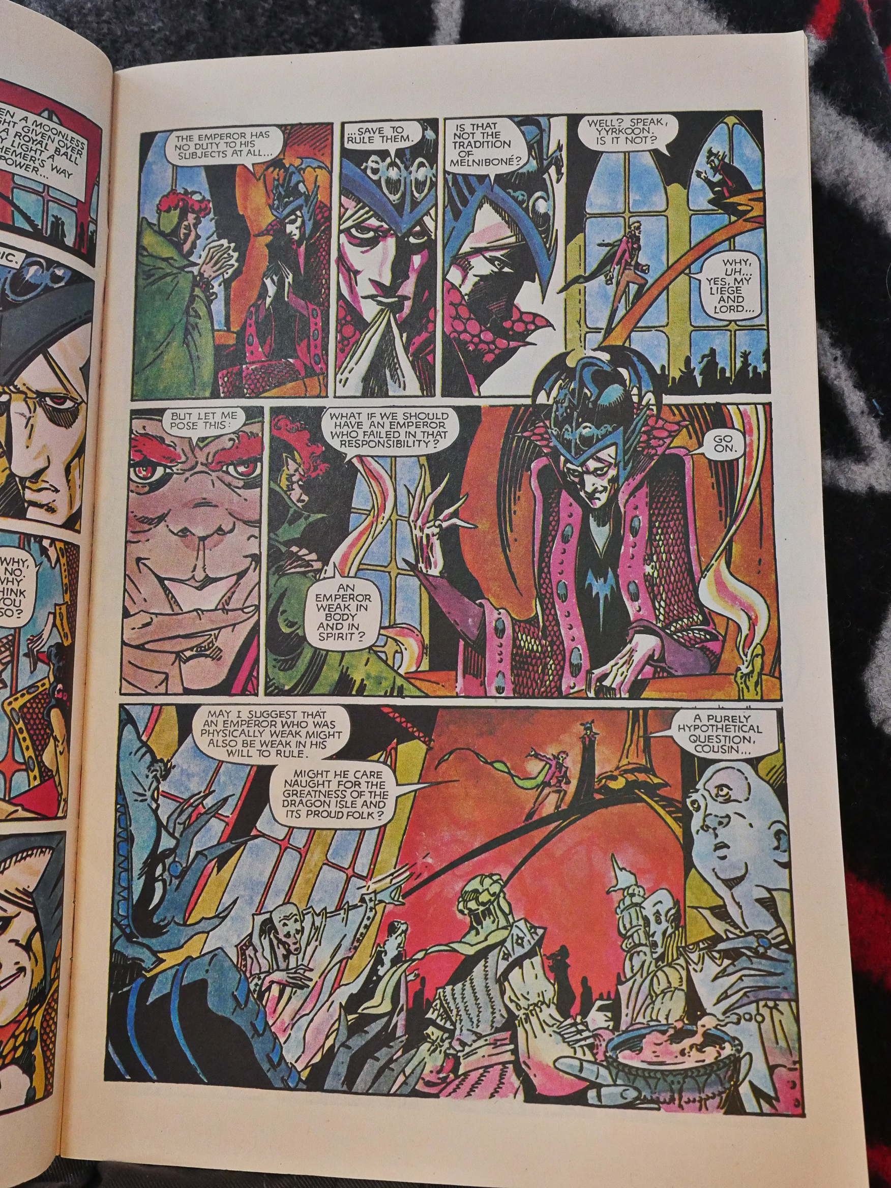
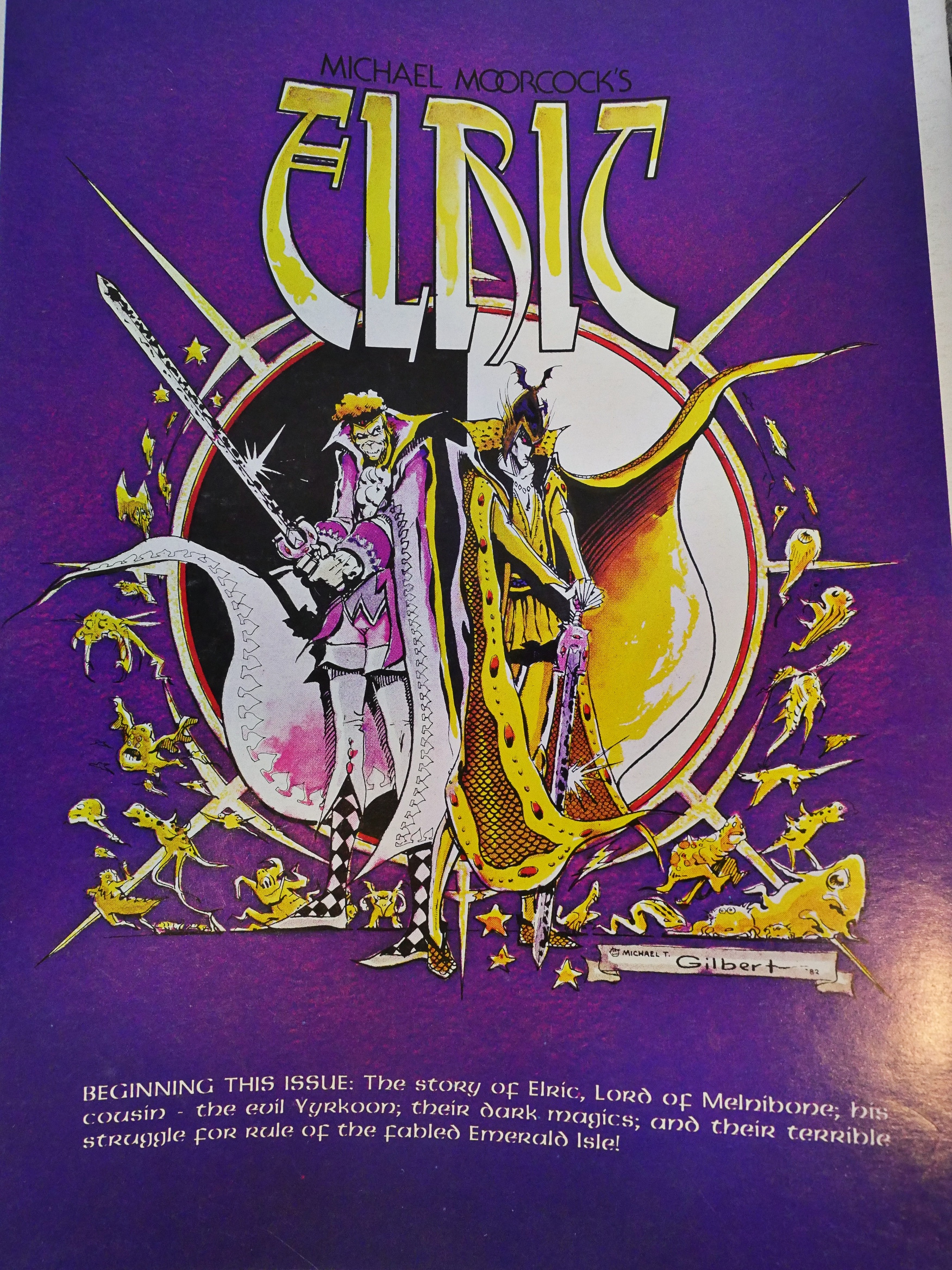
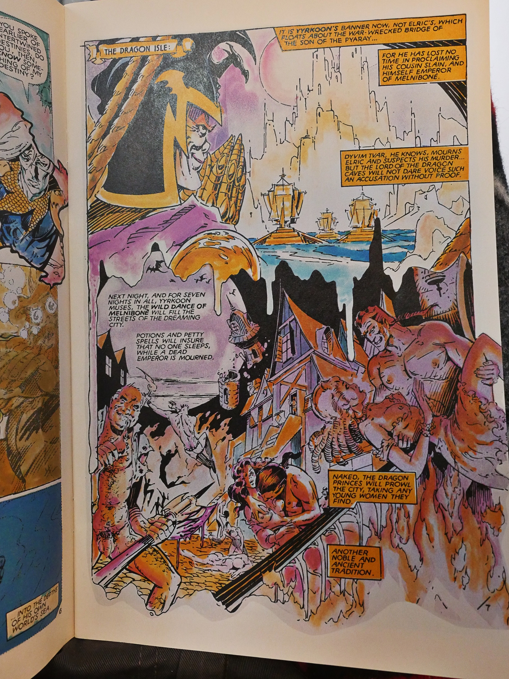
The artwork in the first issues look shifts back and forth between looking more like Gilbert (above) and Russell (below), and some of the sequences are just rather oddly told. Above, Yyrkoon (the red-headed guy) is… laughing? I think? Or is somebody laughing at him?
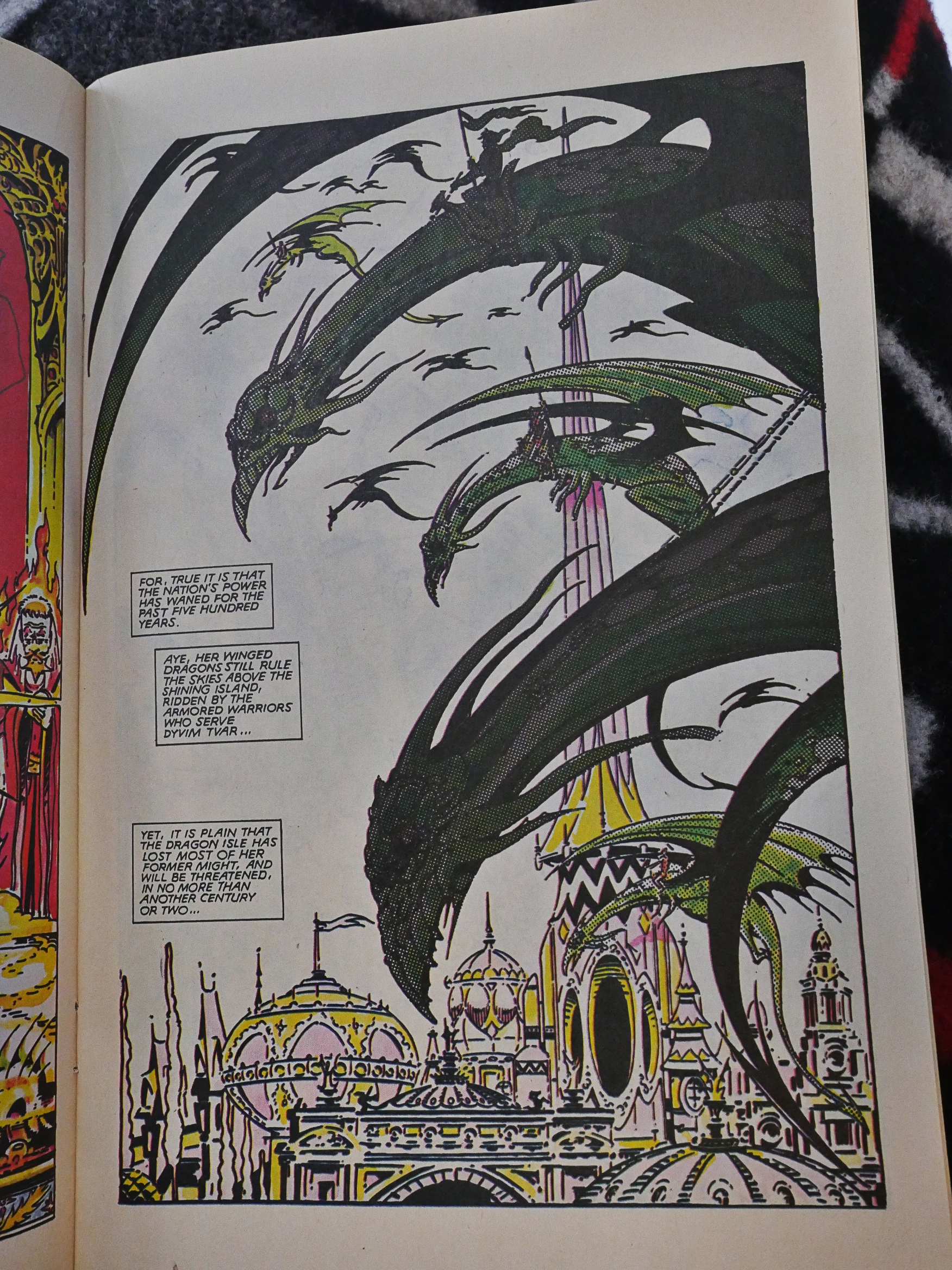
Hey, nice dragons!

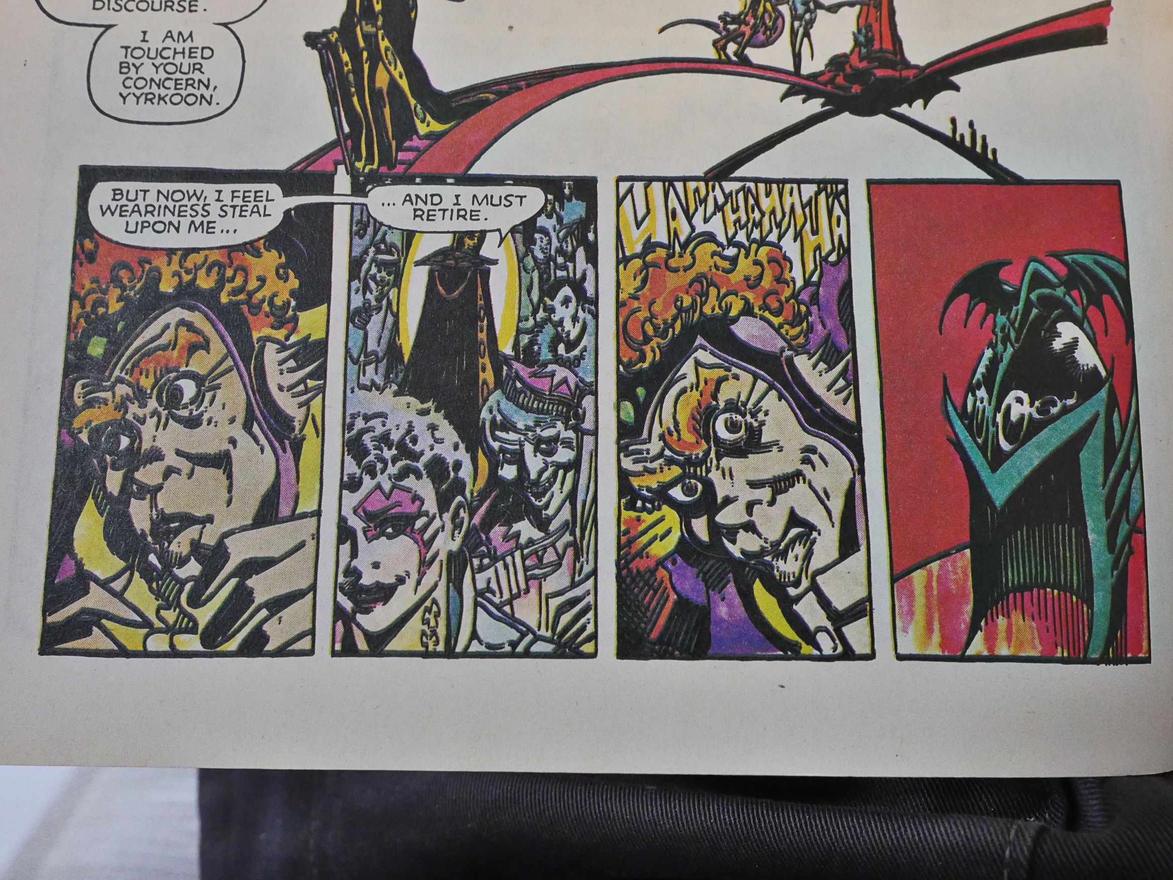
The artist goes to ultra-deformed mode for effect.
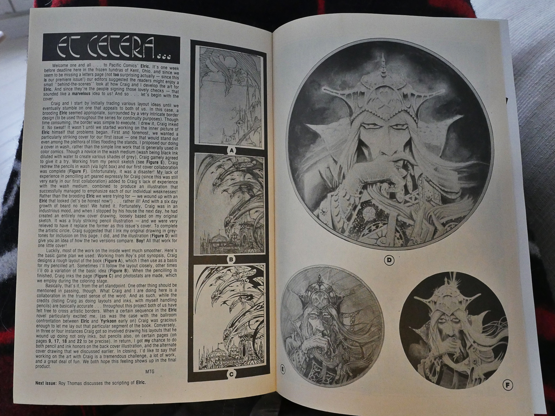
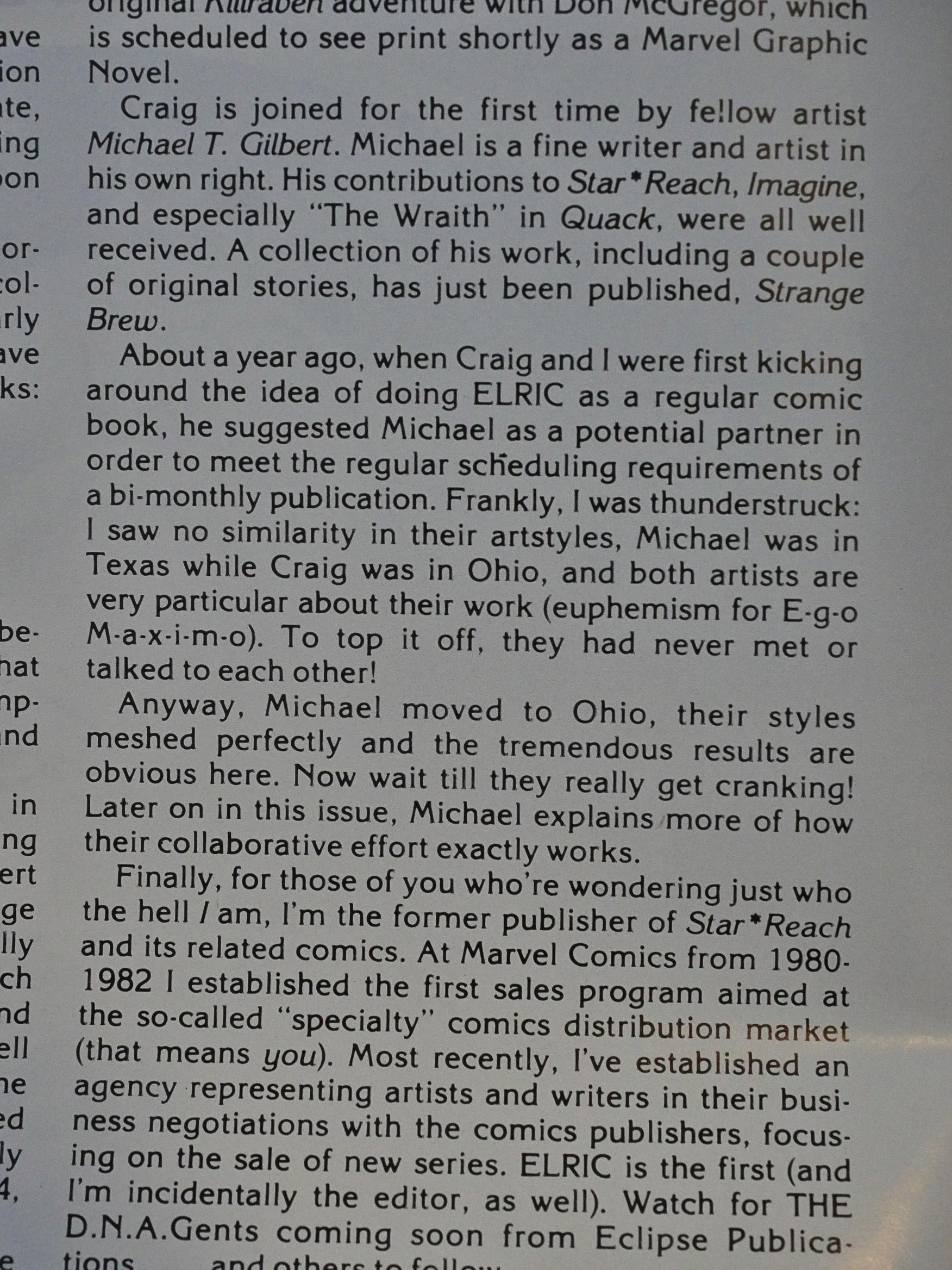
Gilbert explains their working process: Russell does the layouts, and then Gilbert does the pencils, and then Russell does the inking, and then they both do colouring. Seems like a very intimate working situation. Russell and Gilbert had apparently never met before starting on Elric, but Gilbert moved to Ohio (where Russell lived) to enable this working relationship.

The try-out page they did to see whether they’d be able to work together.
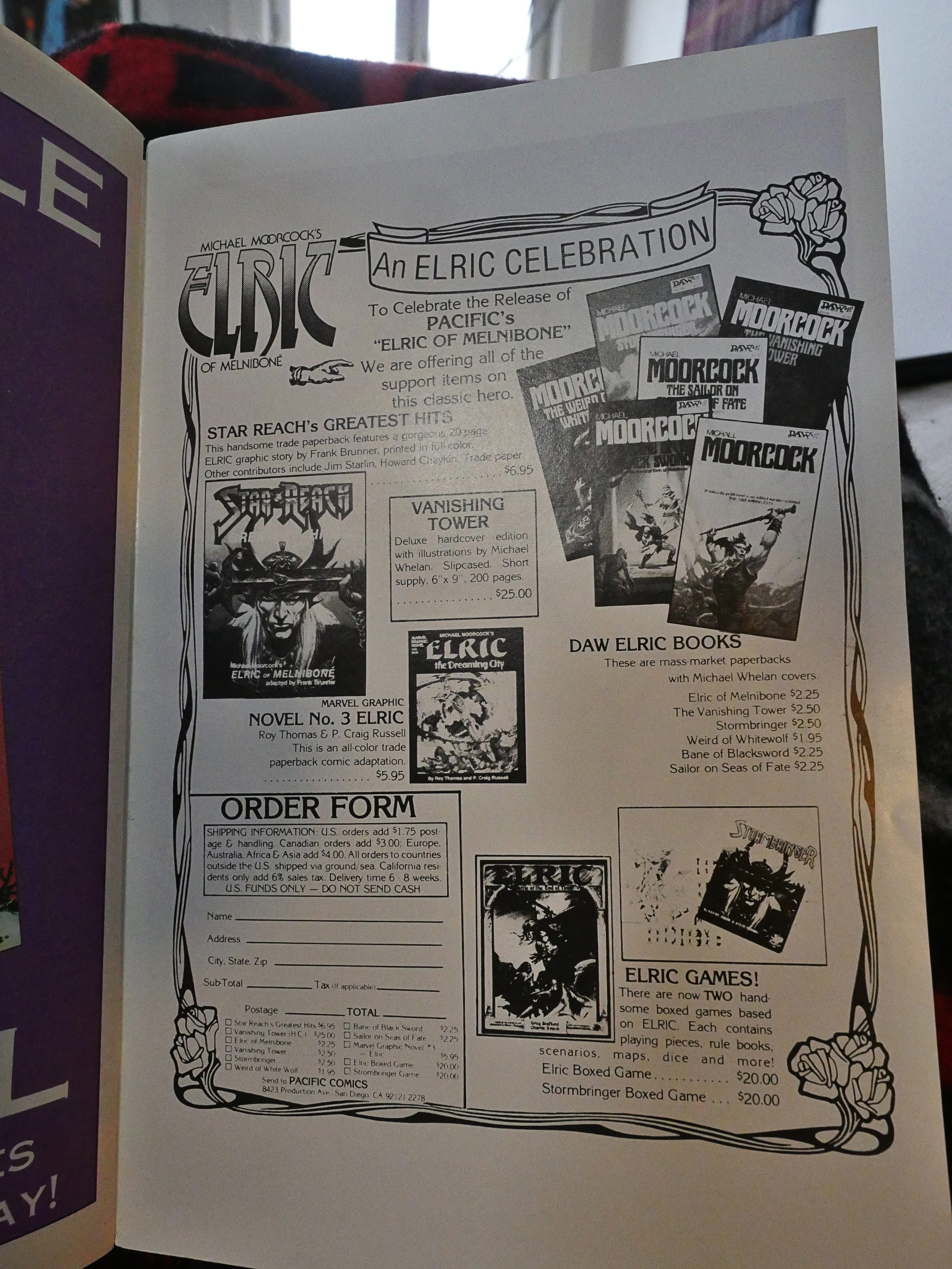
Pacific wisely tries to sell all kinds of Elric stuff to the readers, like the original novels and games and other comics based on Elric.
Gilbert does a solo rendition of Elric and Yyrkoon. Kinda nice that too, eh?

If Moorcock meant for Elric to be a tongue-in-cheek critique of the sword and sorcery genre, it’s not coming through at all in this adaptation. Thomas’ dialogues are turgid. Still, it reads pretty well, unlike a lot of other comics adaptations that try to preserve like the entire text of what’s being adapted.
Hey, fun. Gold ink on the cover. They’re having fun with the book and the production of the book.

Oh! So the first issues had muddy linework because they really were printing all the colours on top of the black ink. I’m such a sleuth. But now they shift to “grey line” colouring. So what does that look like?

Yay! Now the linework is super-sharp and the colours really pop.
I think it’s fun to be able to witness the process of these people trying to work out the technical details of publishing great-looking comics. In 1983, this was still new territory for small publishers in the US.
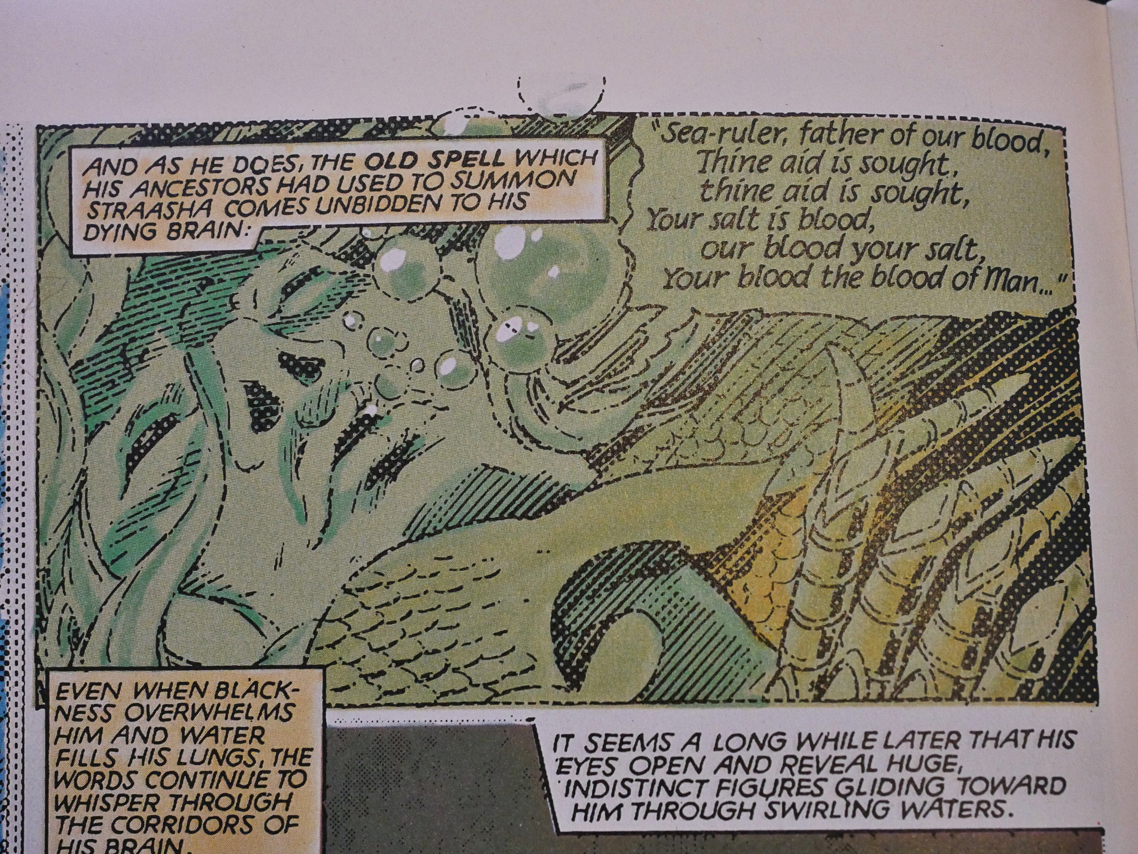
This also allows them to do other fun effects, like this underwater scene where everything is vague and subdued.
And also wispy and chaotic scenes that read clearly.
But… was that meant to look like this?
And it’s got the classic “we coloured in some blocks of this black area here” artefacts here and there, but it still looks good.
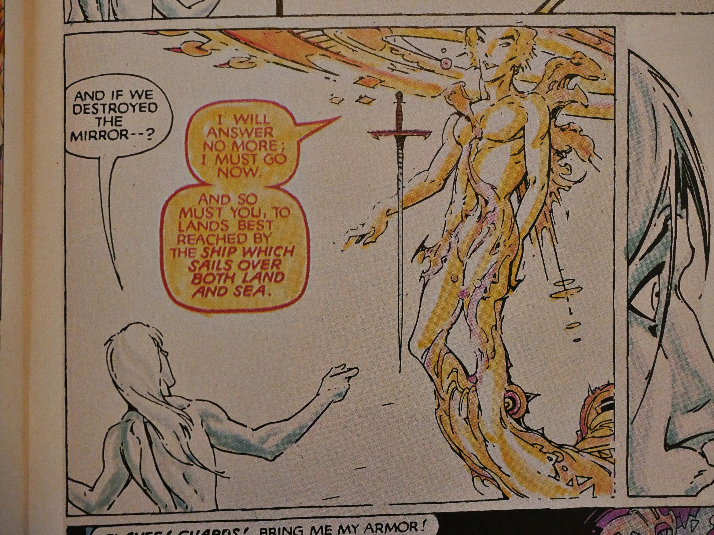
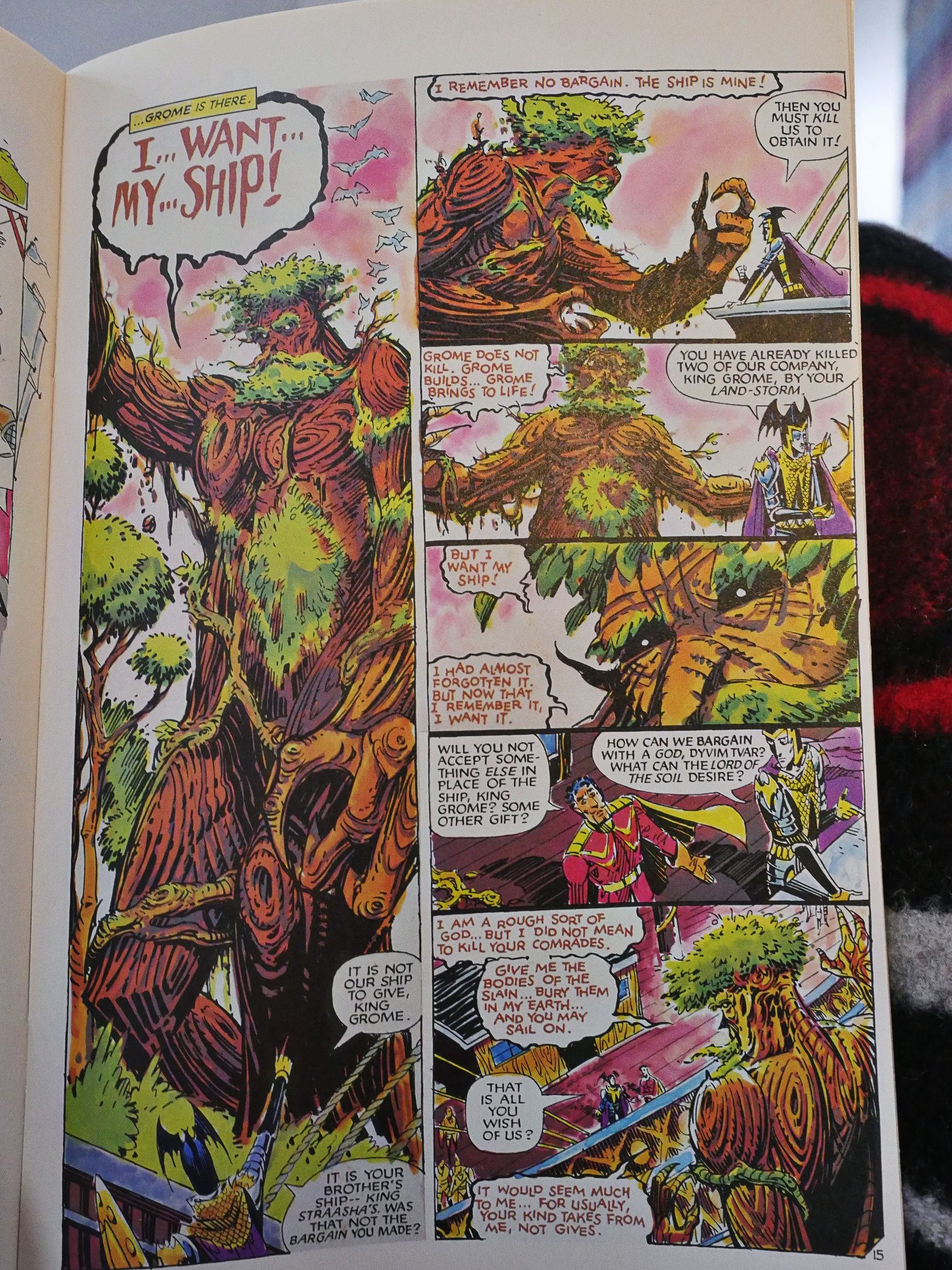
Some of the scenes look very Russellish.
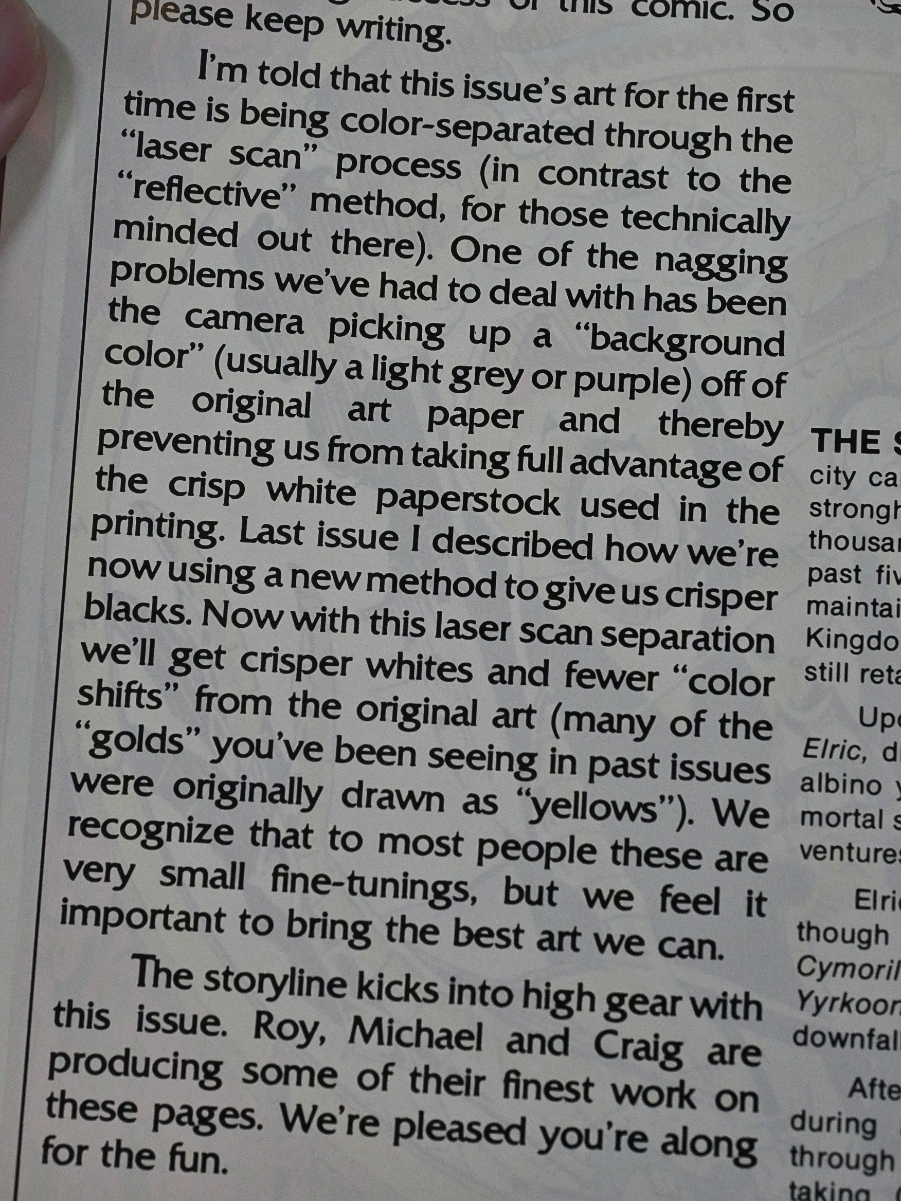
And then they start using “laser scan” colour separations. The innovations never end.
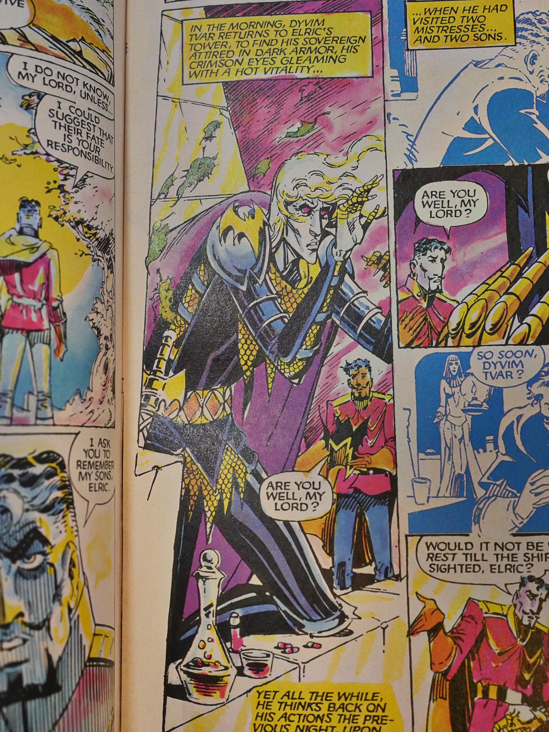
Yowza. I think they’ve now got the separation and printing totally sorted, which is nice, because there’s only a couple more issues to go.
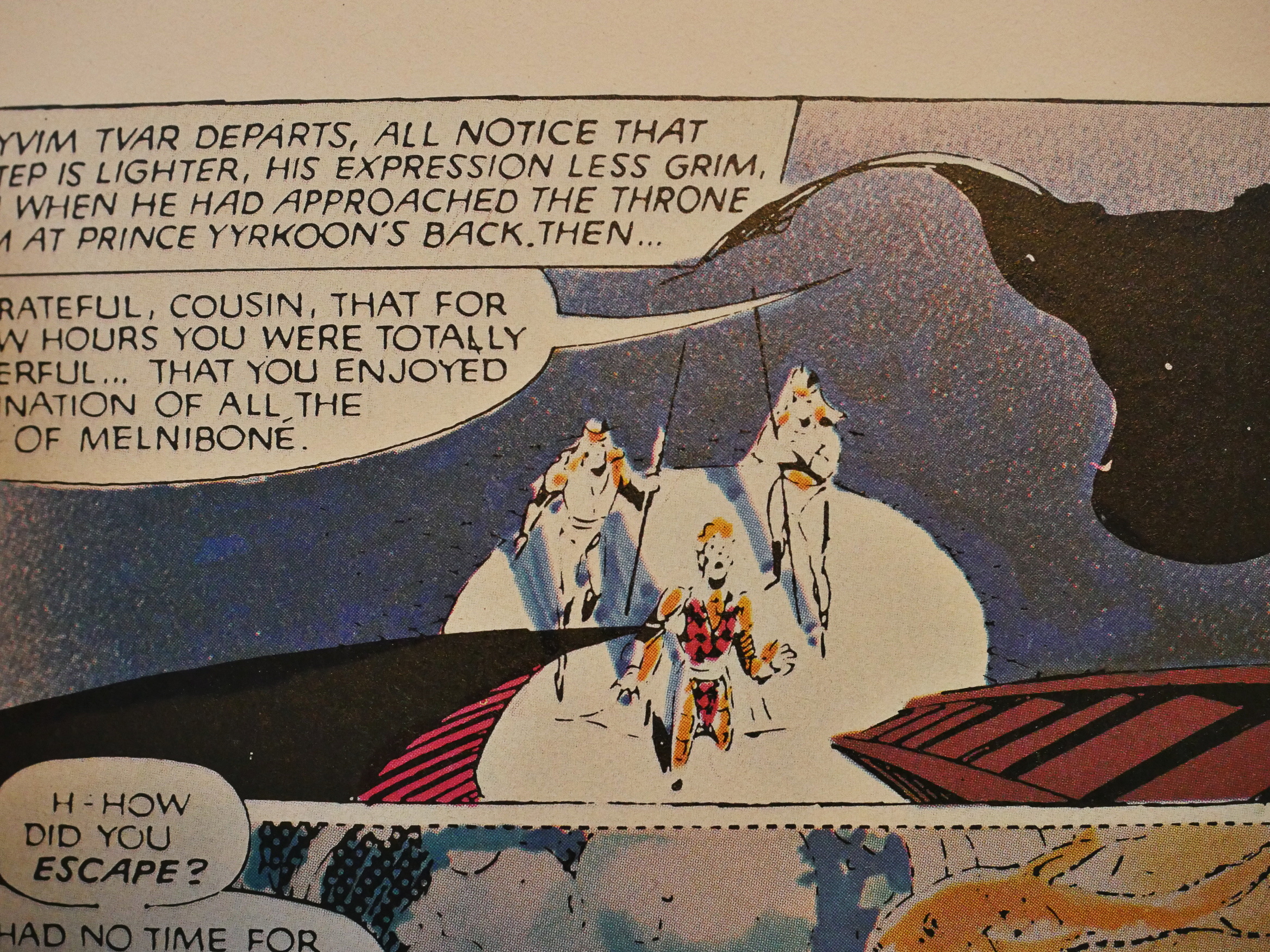
Oh, yeah, the story… It doesn’t really read like a coherent novel. Sure, there’s a plot where Elric has to chase down Yyrkoon, but some of the challenges Elric suffers along the way feels a bit like Monster of the Week.
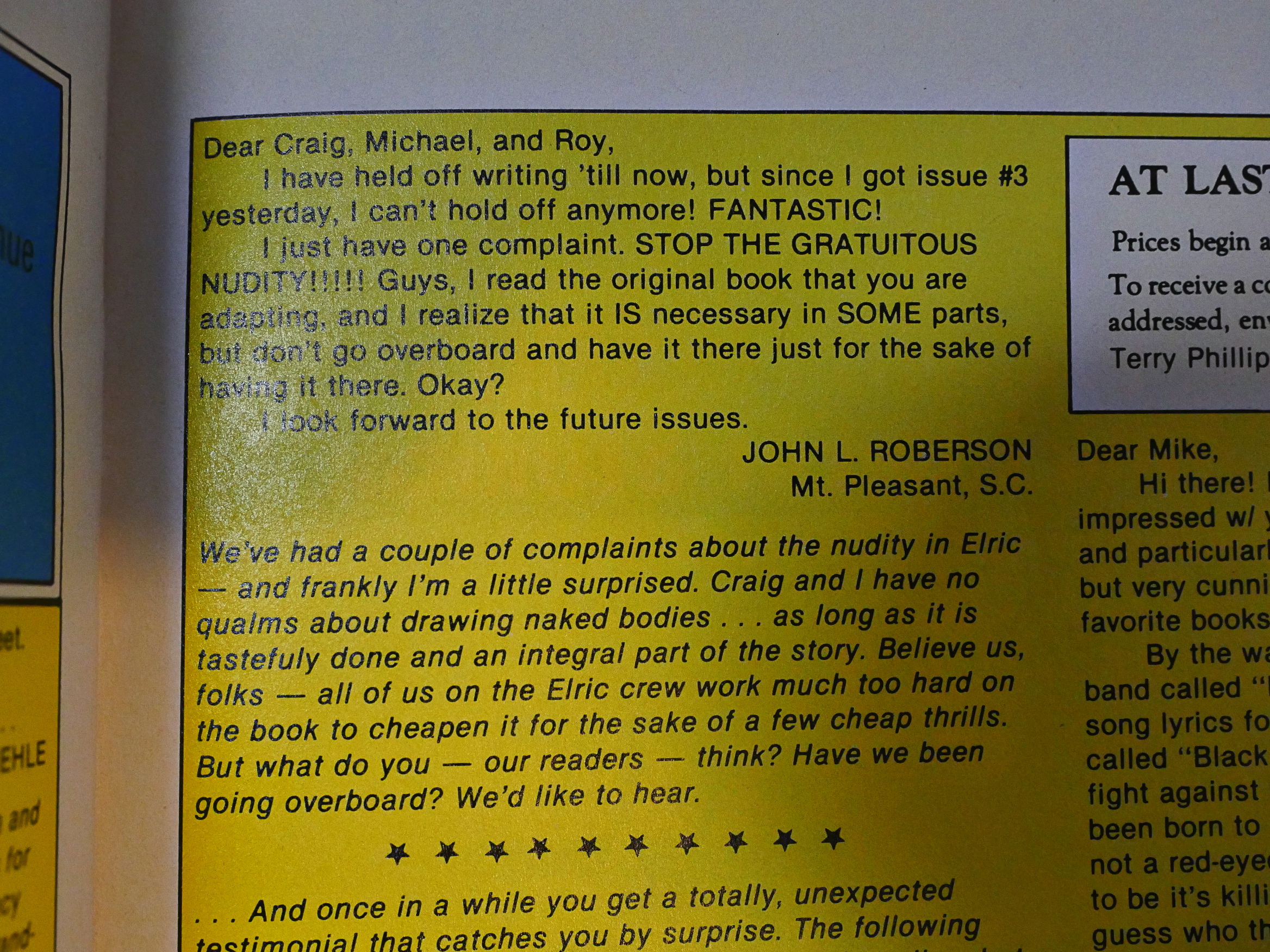
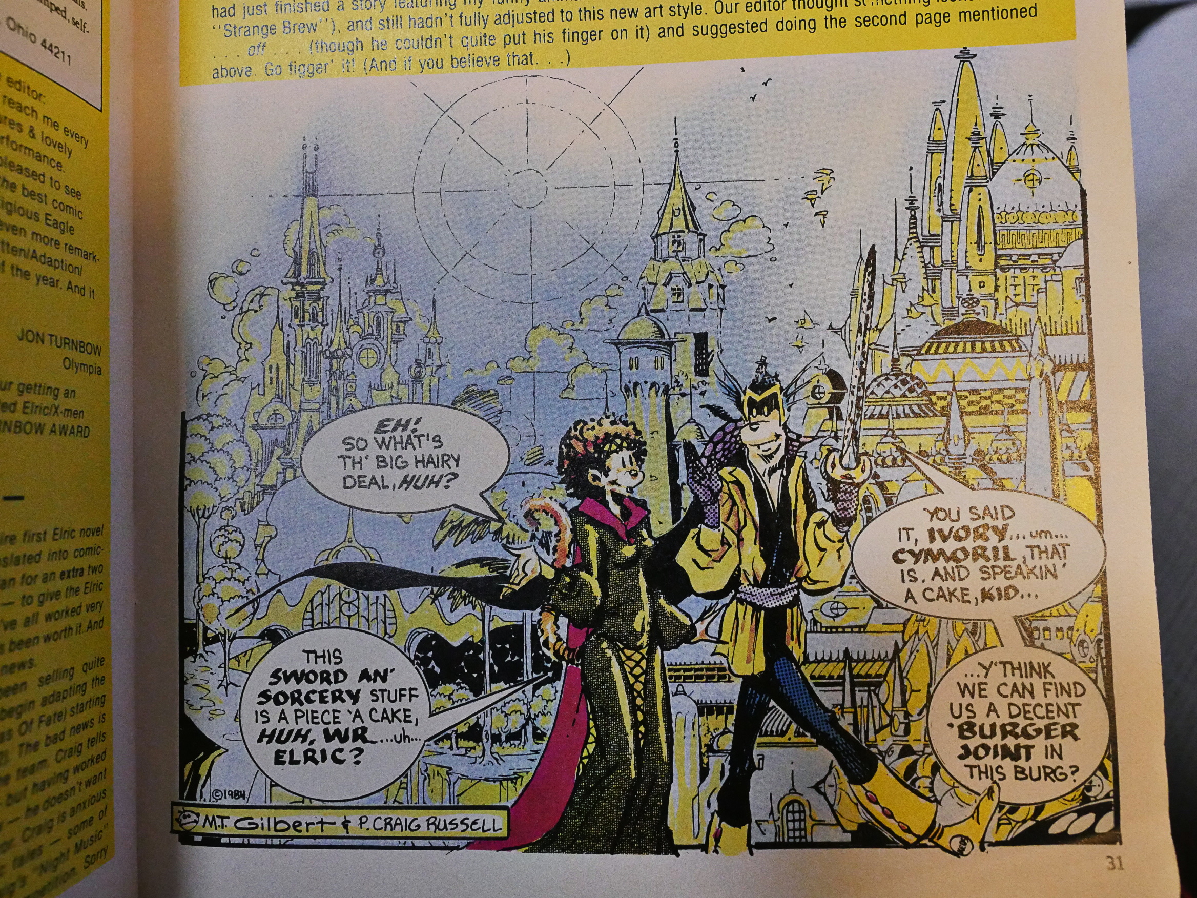
Heh heh. A disgusted reader writes in to complain about all the *gasp* nudity. Of which there is very, very little.
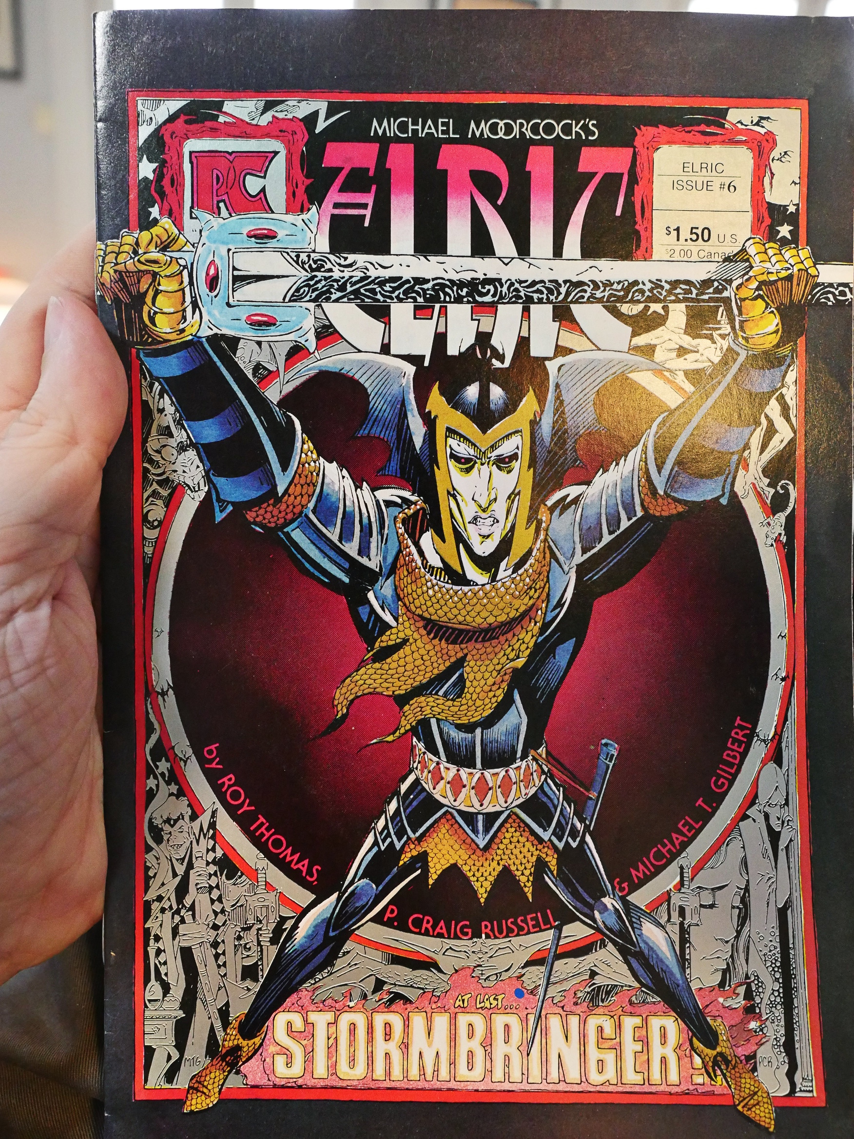
Silver ink!
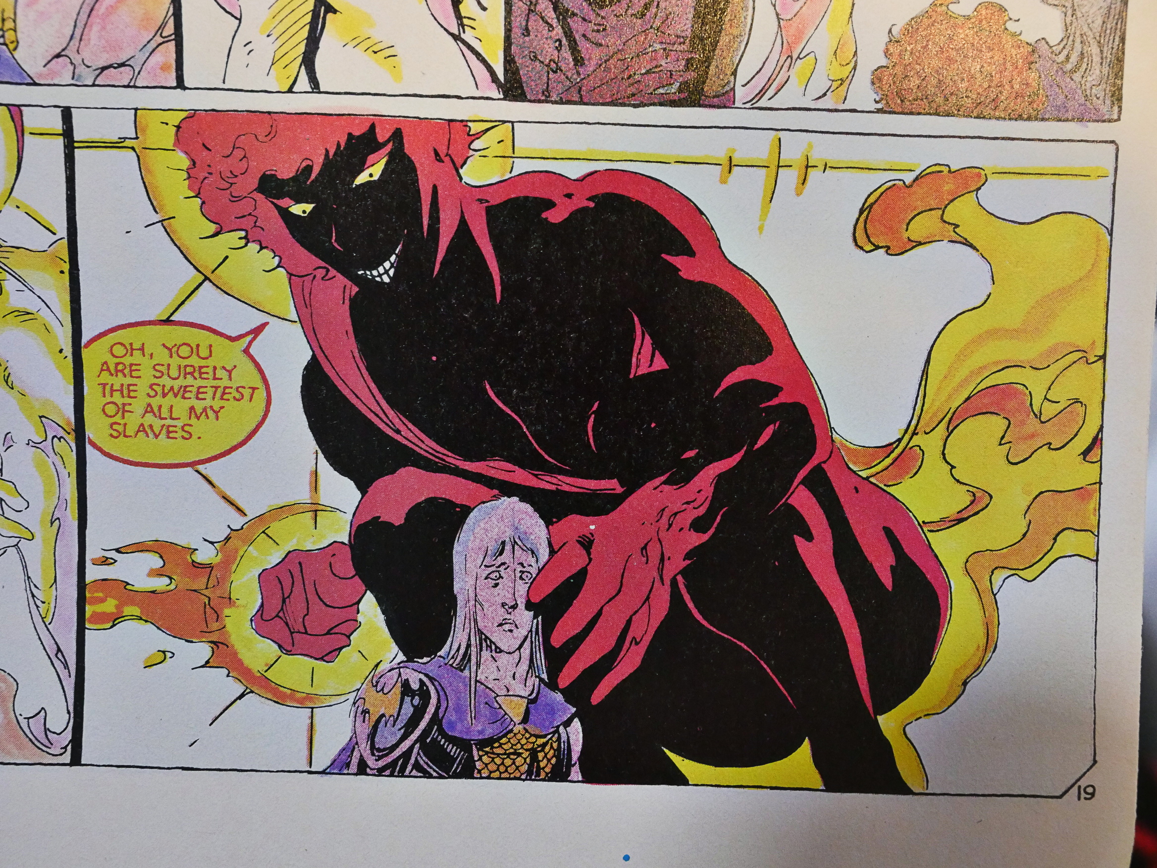
Oh, that’s a great-looking panel.
And as the final issue is done, we get a drawing where they reimagine Elric as done in Gilbert’s style completely instead of the Russell/Gilbert mix they ended up with.
After Pacific went bankrupt (a few months after the final issue was published), the creators took Elric over to First Comics, where a number of novels were adapted. I was apparently not sufficiently interested to keep reading these, because I never bought them in the 80s. But I did buy them recently as reprinted in hardcover editions by Titan.
And the reproductions were simply horrible. It looks like they were facsimile editions of the First comics: Scanned from the printed pages. All the linework was illegible and the colours were horrible. And Russell was only intermittently involved, which was something of a disincentive to me, although I do like Gilbert’s artwork, too…
So what did the critics think?
Carter Scholz writes in The Comics Journal #89, page 51:
Michael Moorcock’s Elric Of Melnibone is
a rarity among epic fantasy heroes: slight of
stature, weak, a scholar, self-reflective, an
albino. It is easy to guess that in creating
him Moorcock set Out to undercut every
tradition and cliche of the genre, and to
prove he could make a workable hero
without them. The exercise is’ tongue-in-
cheek—at least a little. Moorcock is too
intelligent to take the genre as defined by
Robert E. Howard quite seriously, so he
has some fun mocking the Conan ethos
while at the same time reaching back for
the older, richer, more literate British
tradition of epic fantasy.And that is the problem with Pacific
Comics’ adaptation of Elric, of which I
have seen the first three issues. It is not very
playful. Roy Thomas, surely the most pr0-
lific and one of the best adapters of sword-
and-sorcery, has scripted Elric in an utterly
deadpan, brooding manner. (This was lam-
pooned on the cover of Journal by
Aric’s penciller, Michael T. Gilbert.) Only
Gilbert’s art saves the book from terminal
morosity.For instance, the title of Elric #2, “Kindly
Dr. Jest,” refers to the Melnibonean court
torturer. Gilbert has puckishly depicted
him as a distant relative of the Joker, which
is amusing, but Thomas’s title is the poor
leaden sort of thing which passes for
“irony” in comics writing. And it is one Of
the few traces Of humor of any sort in the
writing.Still, the writing is a level better than
Thomas’s usual. He is never incompetent,
and his sense of pace can be superb, but he
is seldom inspired. Here one suspects that
he has taken a lot of Moorcock’s prose
direct. When Elric escapes death from
drowning, and returns to court to mete un-
woötedly harsh justice to the culprits, his
consort protests, “But it might destroy you,
Elric, to follow through with your plan.”
This is sturdy comics writing: flat,
graceless, and prolix. Elric responds:
“What if it does? Let me be destroyed… to
become merely an unthinking extension of
my ancestors. The puppet of ghosts, and
memories, dancing to strings which extend
back through time for ten thousand years.
Now this writing is not good—the meta-
Phor is at once pat and labored—but it is
better than what we might expect in the
context, and for a moment the spirit of
Borges seems to hover over a genre where
Conan is the avatar. One suspects that
Moorcock is responsible for most of these
little touches, and we can thank Thomas
for retaining them.I think if Craig Russell had illustrated
this alone, the series might have been an
art nouveau mortuary, given Russell’s pro-
pensity for heavy ornament. But Russell
has done only the layouts, inks, and colors.
These give a stately look to the proceed.
ings, to match Thomas’s writing, while
Gilbert’s drawing enlivens things. Gilbert
is an accomplished humorist, and his fine
sense Of gesture is the proper acid to
Thomas and Russell’s base.
Well, that’s fair.
Michael Moorcock (his real name) is one of the best fantasy writers in history