
The Complete Pacific Comics Re-Reading Blog Series presents:
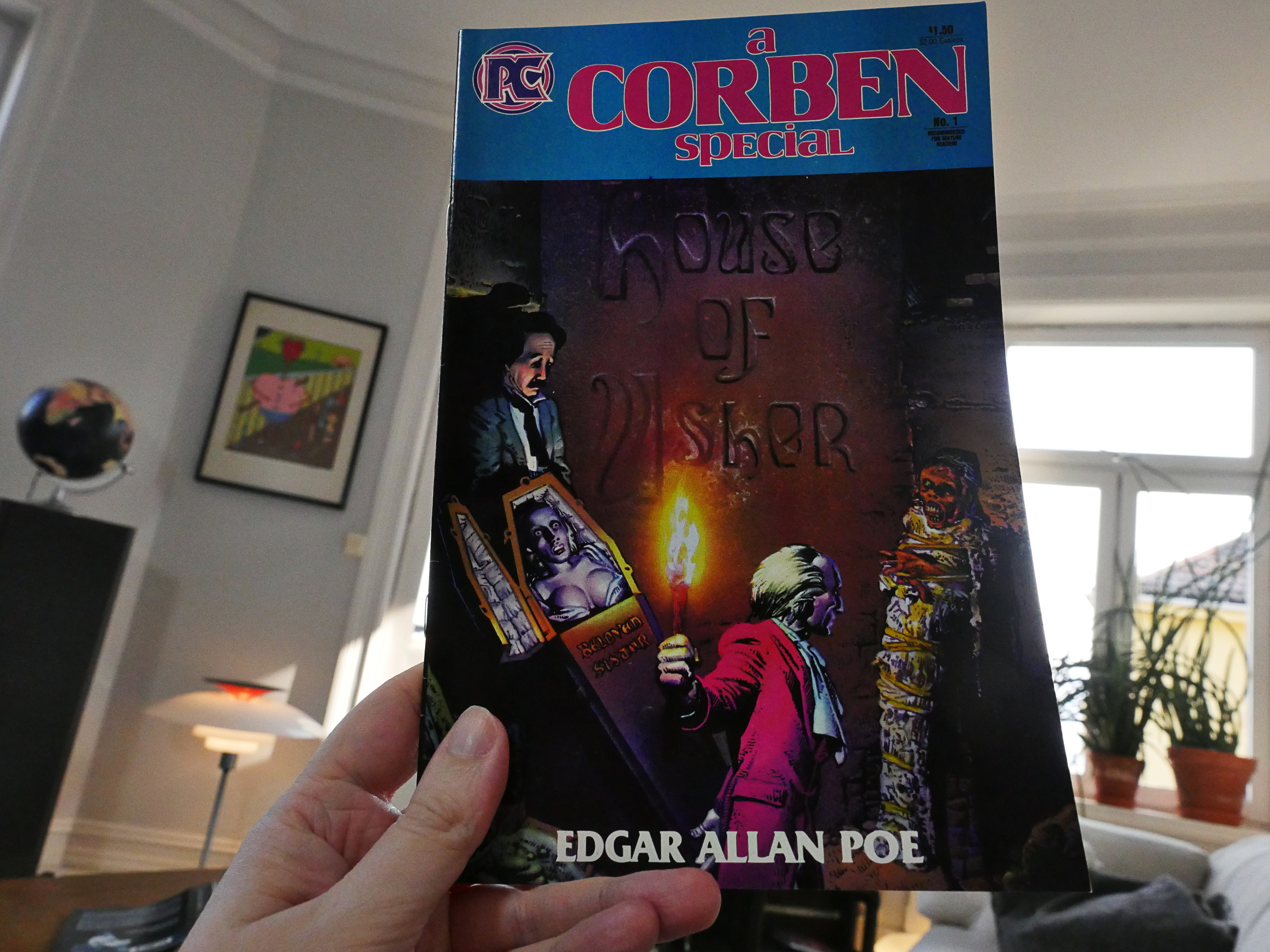
A Corben Special
by Richard Corben &c
A Corben Special (1984) #1
Oh, I assumed that this was going to be a reprint book, but it appears that this Edgar Allan Poe adaptation had never been published before. I bought it a the time it was published, so I should have remembered, but I’ve never been a Poe fan, so…
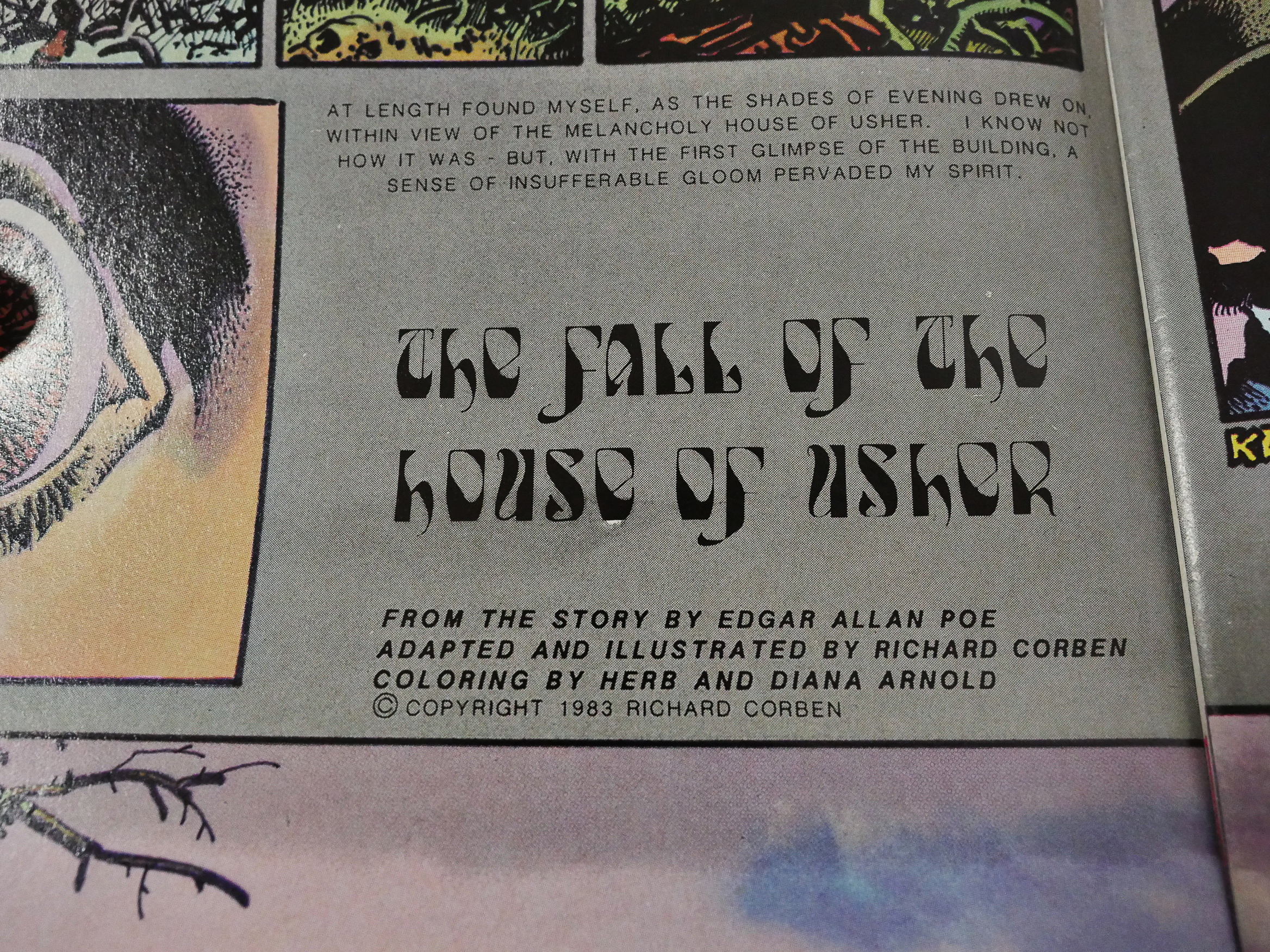
Because, indeed, this is a 28 page adaptation of The Fall of the House of Usher. I wonder why Pacific went with the title “A Corben Special”, which makes it seem so… generic.

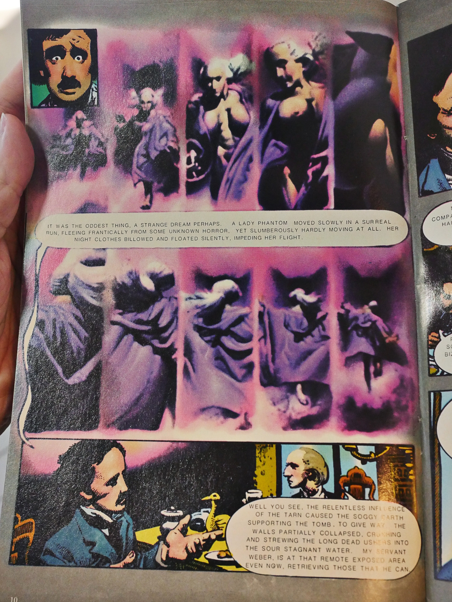
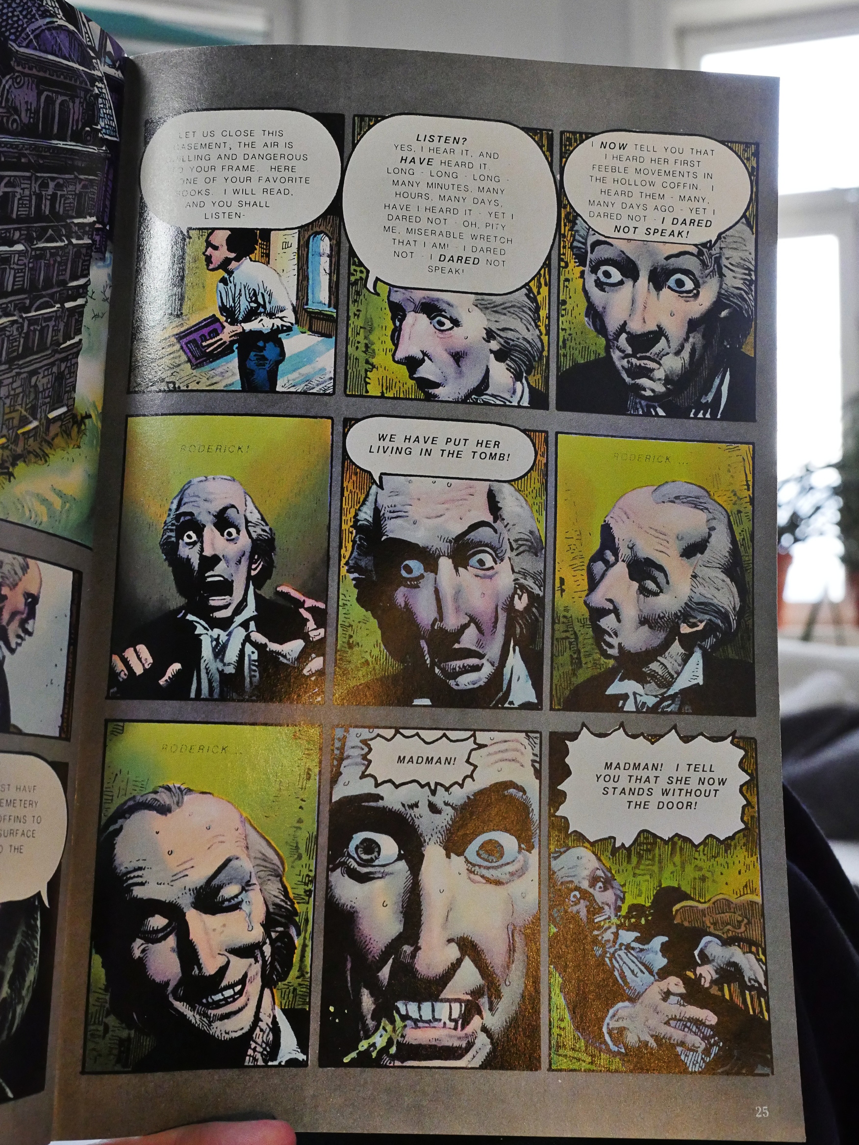
While I didn’t remember this book at all from when I was a teenager, I really enjoyed reading it now. It’s got a bunch of humorous touches, and Corben brings an unusual lightness of touch to this work. He eschews most of Poe’s leaden prose and just goes for it, as here where he doesn’t really show us the protagonist’s fall into the … moat? around the House. I mean, nothing beyond “BLURG BLURK”.
It’s great.
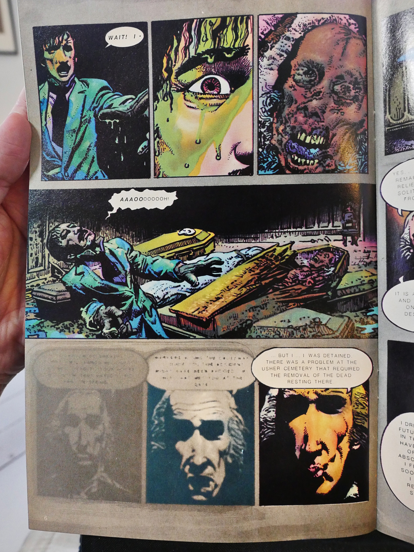
Corben experiments with a lot if different techniques for depicting fainting, dreams, waking up and, generally, being in a state of befuddlement.
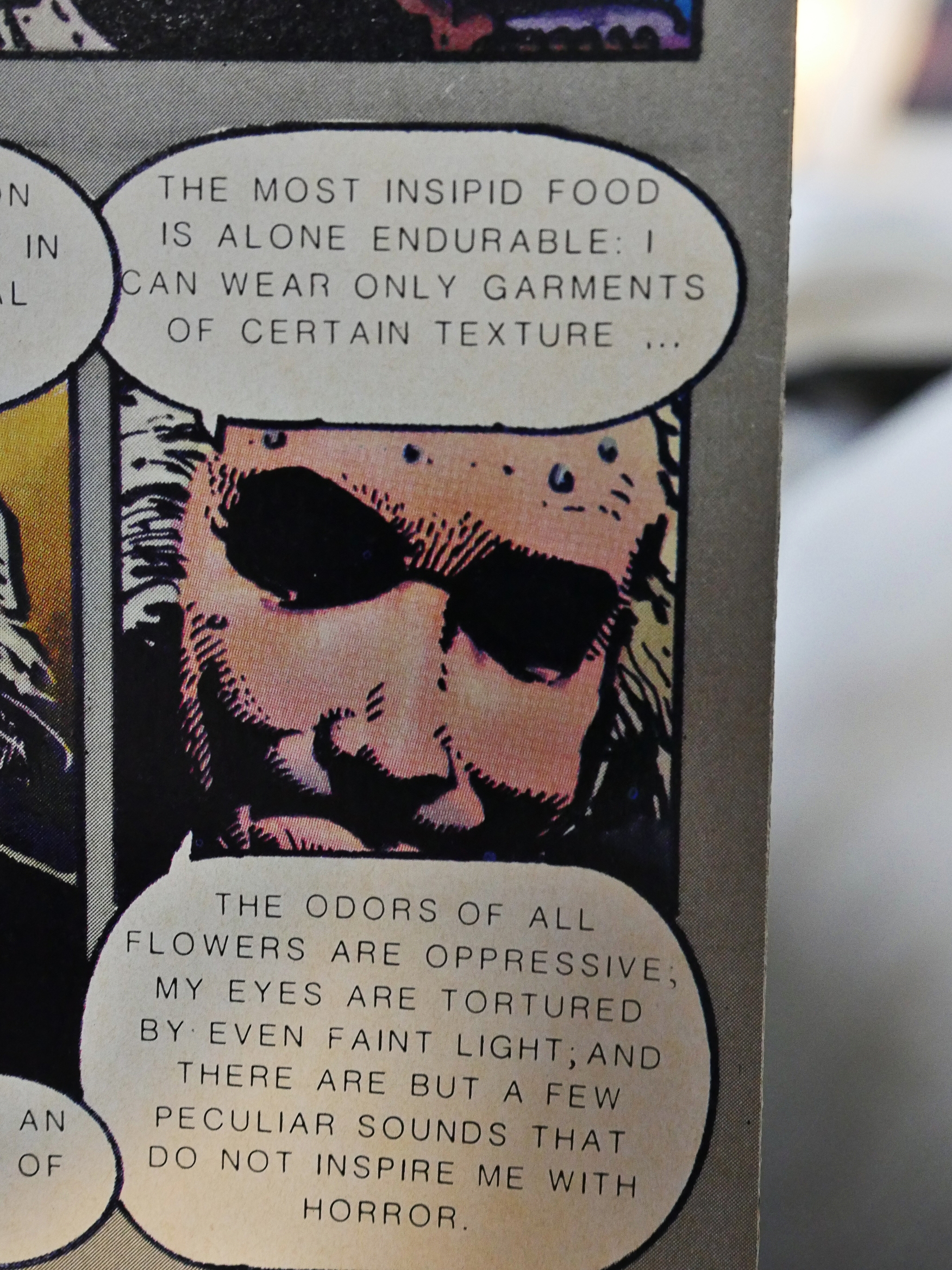
Hm… So he basically suffers from chronic fatigue syndrome (CFS/ME)? Too bad that wasn’t a diagnosis back then: Perhaps he would have survived.
While most of the book is drawn in Corben’s inimitable pen and ink style, he’s aptly abetted by the colourists to get to something that looks a bit like his painted, bulbous style when the story calls for it.

Or, I mean, when sales call for it. Was this bit really in the original Poe?
I’ve read many Corben Poe adaptations, and none of them have really appealed to me… until now. Corben is really on point here: It zips past, it’s funny, it’s a bit scary and it’s totally deranged. Just about perfect, I think.
R A Jones writes in Amazing Heroes #50, page 132
he ultimate instru-
ment for this evocation however, is
not the illustration but the coloring.
The rich and imaginative use of
tones, particularly blues and
violets, lays a surrealistic filter over
the artwork that magnifies it ten-
fold. It is the color of insanity and
through it we are drawn to the
page. Where the juxtaposition of
colors occasionally detracts from
Corben’s science fiction work,
here it complements his art, forme
ing a partnership that creates a text-
book model of graphic storytelling.
Corben has apparently revisited the Usher story and done another adaptation? Looks like a longer version.
According to comics.org, this version was reprinted by a bunch of European magazines at the time, but it’s never been reprinted in the US, which is odd.